MODERNISING THE ICONIC BUTTERKIST BRAND
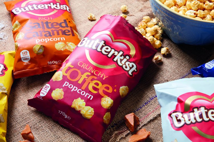
Leading popcorn brand Butterkist has evolved its branding and launched new packaging.
We were tasked with modernising the ionic popcorn brand identity, whilst still retaining Butterkist’s well established brand assets which have helped build a widely recognised and universally loved brand.
Ensuring that the Butterkist’s heart remained within the new brand identity, our new packaging seeks to hero the brand, with a cleaner, modern look brought to life through a more vibrant colour palette. The introduction of emotive food language to emphasis flavours is also a significant feature on the new dynamic and energetic packaging.
Anjna Mistry, Senior Brand Manager, at Butterkist, said: “The new pack brings the brand essence to life through a bolder, fresher and more contemporary look, and communicates Butterkist’s irresistible taste and fun personality.
Each flavour is colour-coded for clearer differentiation, providing greater shelf stand-out and ease of fixture navigation, to help tempt consumers towards Butterkist’s wide range of moreish flavours. CHILLI have done a fantastic job on interpreting a challenging brief of an iconic brand and keeping with the core values and identity of the brand through its transition to be more relevant and modern.”
Our Creative Director Scott Wardle, added: “We’re absolutely thrilled to be working with Butterkist as it’s such an established brand. The research showed that the UK has a lot of affection for Butterkist and the challenge was to bring its strong brand identity into 2017 without losing its values – and we’re confident the new packaging will bring Butterkist continued success.”
The new packaging can now be seen in all the major UK supermarkets.
Written by: