Fresh from the fields
Our challenge:
In a category dominated by a number of major players, Glebe Farm needed to review its brand
and packaging design to help tell its story of producing great tasting oat milk using only the best British oats. The current brand and packaging design had met with some success but they felt there was potential for it to do a lot more.
Getting started:
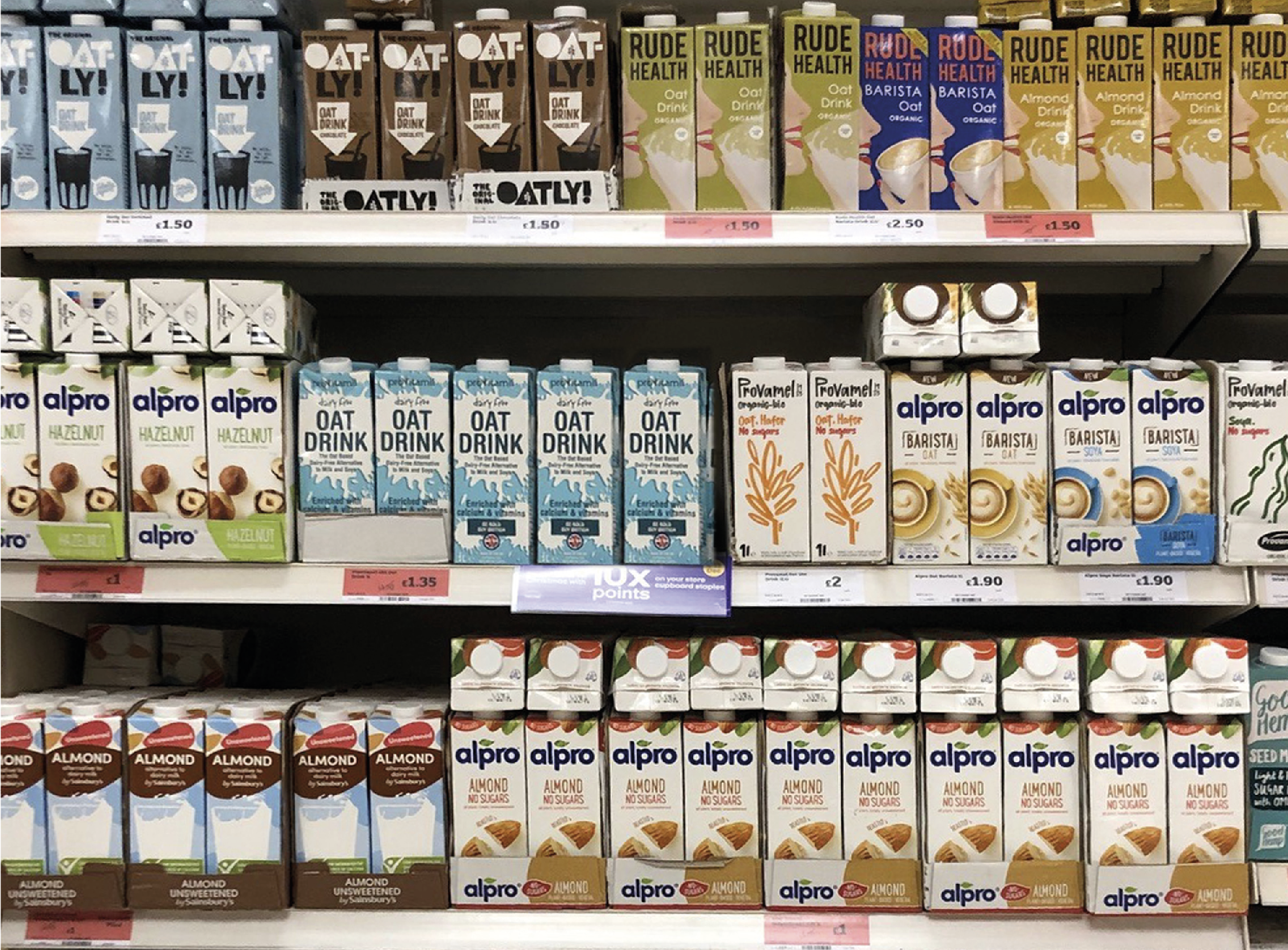
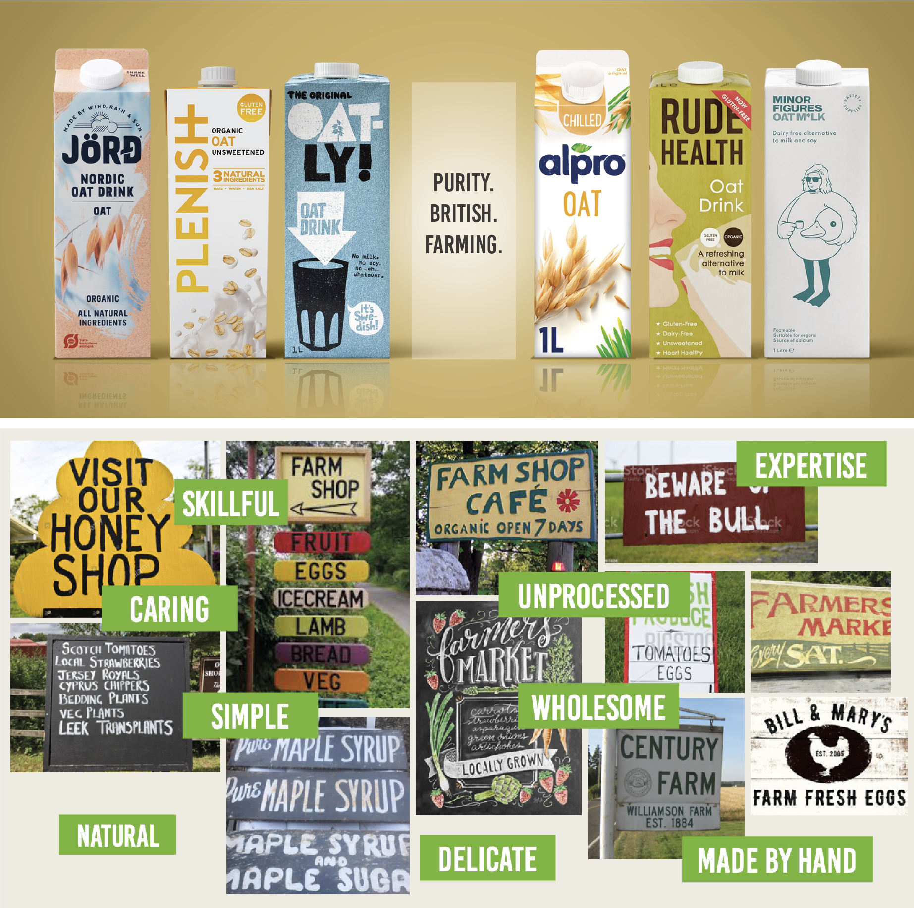
Our in-store review of the category quickly highlighted that stand-out in such a crowded fixture was going to be a big challenge. We also undertook a number of shopper research groups to find out exactly what people thought of the competition and also gain an insight into what Glebe Farm could offer that would tempt them to try and buy their oat milks.
Our solution:
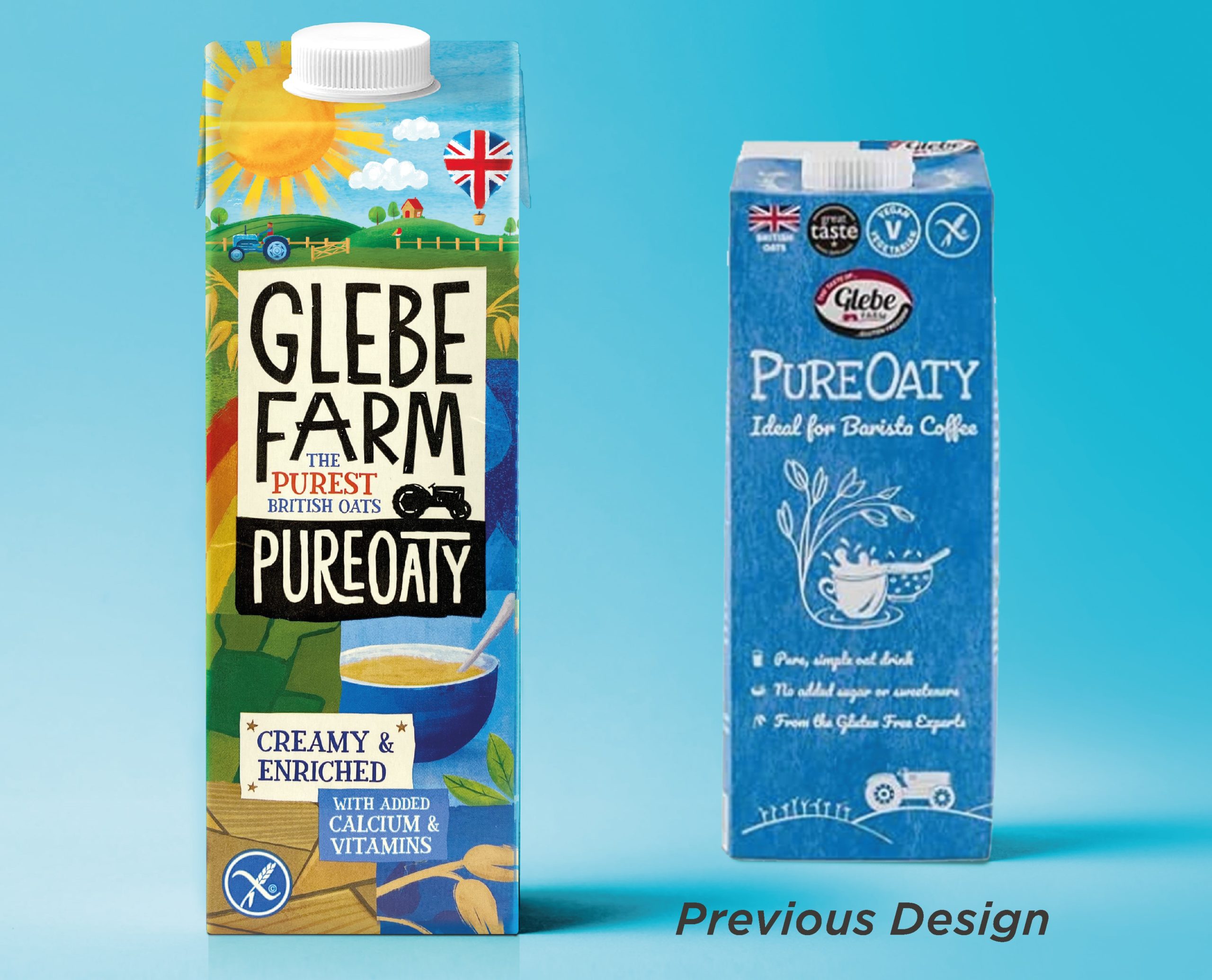
After considering all the research and insight as well as our own observations on the category we developed a creative direction for Glebe Farm that placed them in the category as standing for ‘The Purity of British Farming”, a clear position that they could own and would help them effectively challenge the more established competitors. The farm needed to be at the heart of the brand and be delivered through the packaging design. Shoppers loved the farm story and the fact that British oats were used in the production made them feel it was something local to them.
After careful consideration of a number of creative applications we decided on a visual style and tone of voice that showcased the brand positioning in a striking and distinctive way. The new Glebe Farm brand would evoke a sense of the individual craft, skill and dedication given to farming the oats whilst giving British farming a vibrant look that is modern and relevant for today’s retail environment.
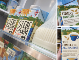
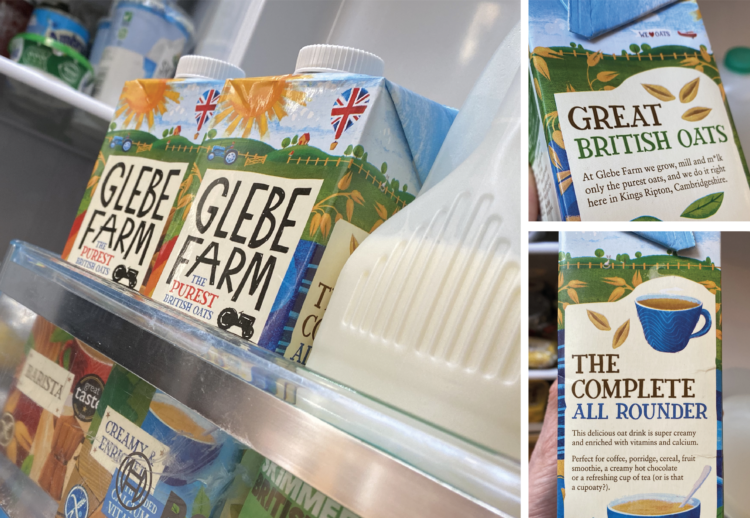
The final design provided Glebe Farm with a fresh, colourful tapestry on which a hand-made custom typographic style could communicate a revised, clear brand identity. This helped to place the farm at the heart of the design, with a clear proposition centred around ‘The Purest British Oats’, giving shoppers an engaging reason to buy.
Creating a great first impression in store:
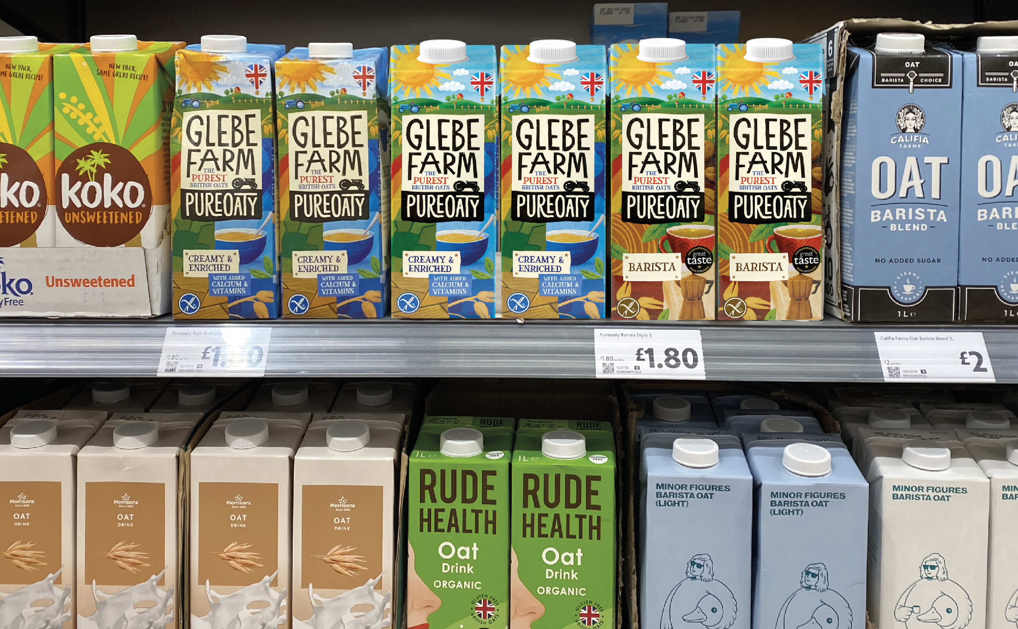
The new packaging design really cuts through in the fixture, offering shoppers something different and delivering on ‘The Purity of British Farmed Oats’ proposition.
Delivering results:
The client is pretty happy….Rebecca Rayner said “We are delighted with the new brand and packaging design and it’s already helping to deliver results, with new listings in Morrisons.”

Written by: