How CHILLI established a new look and feel for the Co-op’s Free From range.
We’re all increasingly familiar with Free From. Whether it’s gluten-free, dairy-free or meat-free, for medical reasons, dietary preference or just a healthier lifestyle, the shift in attitudes towards Free From products is changing the way we eat, and the way we shop.
With the market growing year-on-year, there’s a tasty opportunity for retailers to respond. So naturally, when the Co-op tasked us with redesigning the packaging for their Free From range, we couldn’t wait to serve up some strategic design expertise.
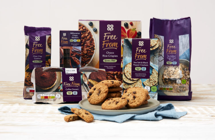
Free from on-shelf impact.
The Co-op’s rebrand in 2016 returned the chain to its roots under the banner of its original 1968 logo. As such, all of the supermarket’s own brand ranges were redesigned, incorporating the original logo, as well as a new typeface and a few other subtle design cues.
While this achieved the desired uniformity across the Co-op’s own brand ranges, the flipside was that the new Free From packaging needed more standout on the shelf, particularly in stores with no designated area.
So in a Free From nutshell, this was our brief: create a new packaging design that stood out on the shelf, that communicated the Free From nature of the product range and that installed trust, both in the quality and the taste.
A closer look at the category.
Like any CHILLI project, we began with an in-depth market review. As well as looking at the Free From landscape in the UK, we also worked side-by-side with our Sydney office, as they have a significant Free From market in Australia.
Armed with our initial findings, we then held focus groups with Free From consumers. This not only gave us an insight into what customers want from the category, but also enabled us to gather direct feedback on the existing Co-op designs.
The new Free From framework.
We then set about creating our design framework. From our research, it was clear that the messaging hierarchy was in need of adjustment. So to improve on-shelf impact and customer recognition, we made the Free From label a standout feature of the design.
Similarly, we needed to make clear what ingredients each product was Free From. So we also introduced a new suite of lozenges, with different colours and shapes for gluten-free, milk-free and egg-free, replacing the less inviting linear icons from the previous designs.
Another key objective for us was to assure customers of the taste and quality credentials of the range. To achieve this, we introduced a rustic style of photography, giving the category a more homely and natural feel.
How do you know if you haven’t tried it?
We were delighted with the new designs, but they were largely untested with our target audience. So, using online consumer testing software, we then presented three refined packaging designs to Free From customers.
This final step enabled us to determine which design would resonate best in the category. The testing also provided assurances that our final framework delivered against our original objectives ahead of the launch.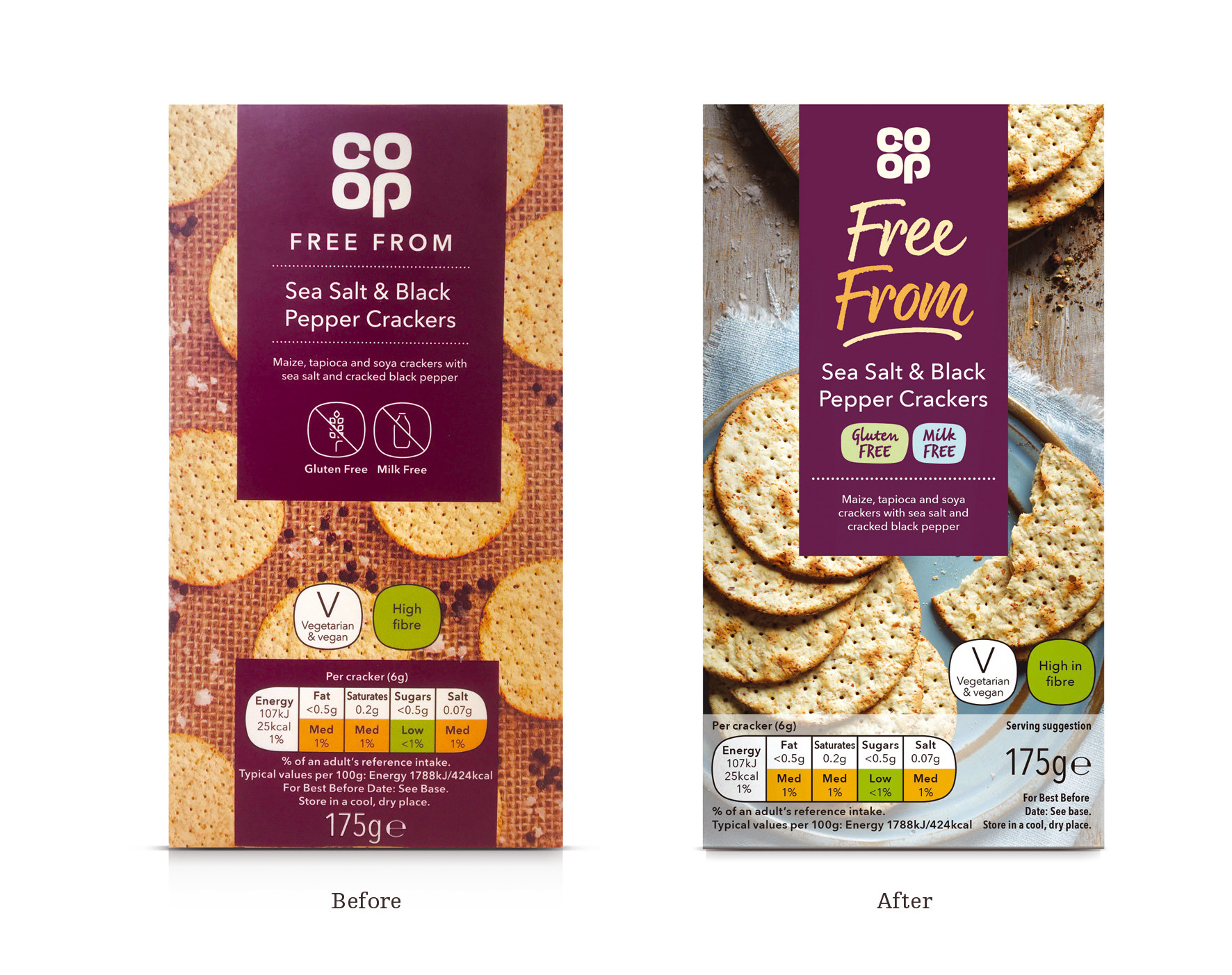
Written by: