Welcome to our latest work update.
The stories below tell you how we have given Upstream a new adventure…Relaunched the Vale of Mowbray brand, redesigned the health range for the Co-op and revamped Cadbury Dairy Milk Ice Cream!
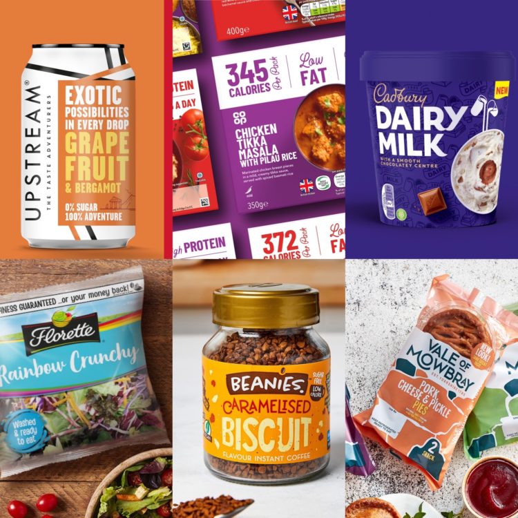
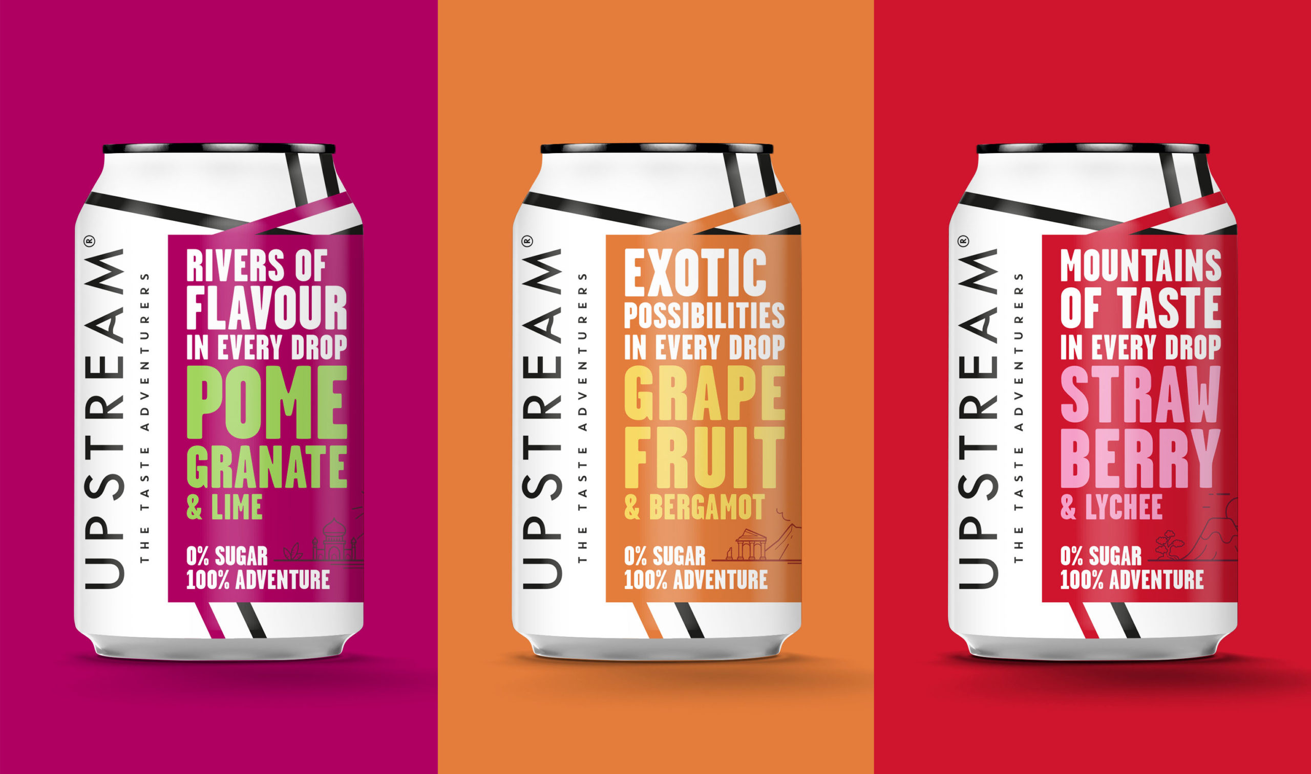
We’re really happy to have completed the relaunch of Upstream with a new packaging design. It’s made using natural fruit combinations, and we developed a simple yet powerful packaging design to reflect this with a colourful focus on flavour. While also opting for a clean, contrasting background to reinforce the products health credentials. A revised pack architecture and on pack messaging, with a more adventurous tone, all combine to create a new pack design with strong shelf standout.
BEANIES – BRINGING FLAVOUR TO THE FORE
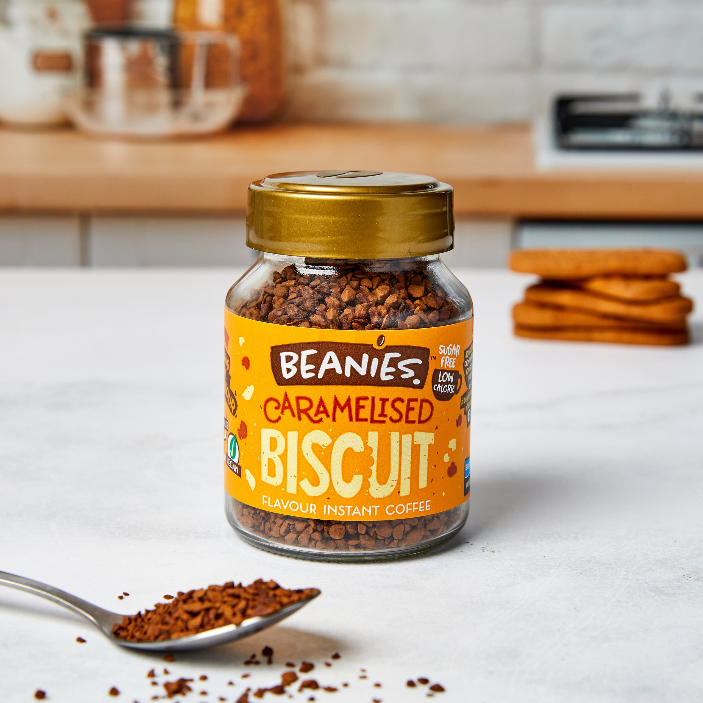
We are absolutely loving the new look that we have created for Beanies! With an extensive product range, including some great new flavours, the brand needed to reflect the varied options on offer whilst creating a coherent and recognisable aesthetic across all lines. We started by creating a new brand promise along with a new positioning. Then redesigned and refreshed the Beanies identity along with the packaging.
CO OP – CREATING A STRONG IMPACT
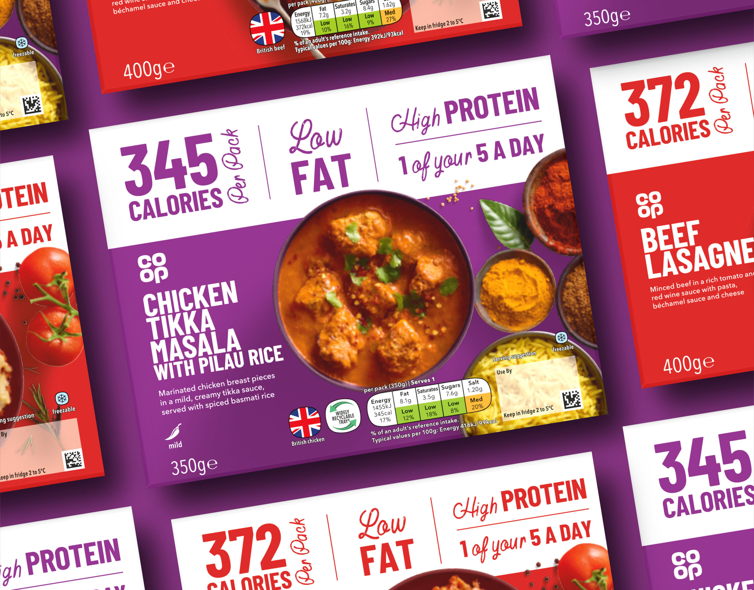
It’s been great working with the Co-op on their latest new launch. We were asked to redesign the Co-op’s range of healthier products including things like ready meals, soups, fruit juices etc. It’s a range that covers both reduced fat, lower salt, less calories as well as ones with added vitamins, source of protein, high in fibre etc.
VALE OF MOWBRAY – PIE HEAVEN
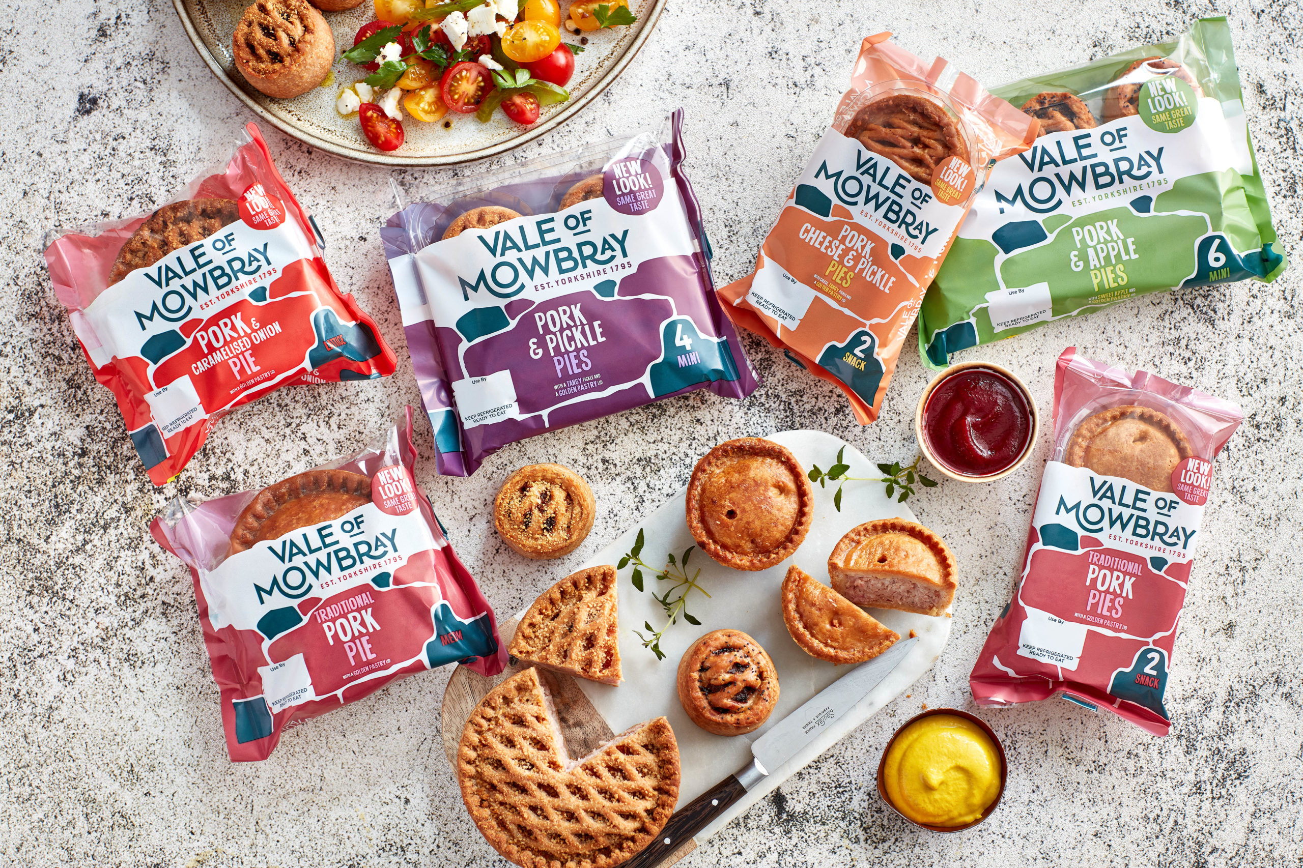
We’re excited with the fresh new look that we have created for Vale of Mowbray. The design takes inspiration from its 200-year history and Yorkshire location but with a more contemporary vibe. We have injected modernity into the brand identity using a bold font to deliver a confident and established feel. The new packaging, which will deliver improved shelf standout, uses a modern suite of colours but with a nod to it’s Yorkshire roots through a stonewall graphic.
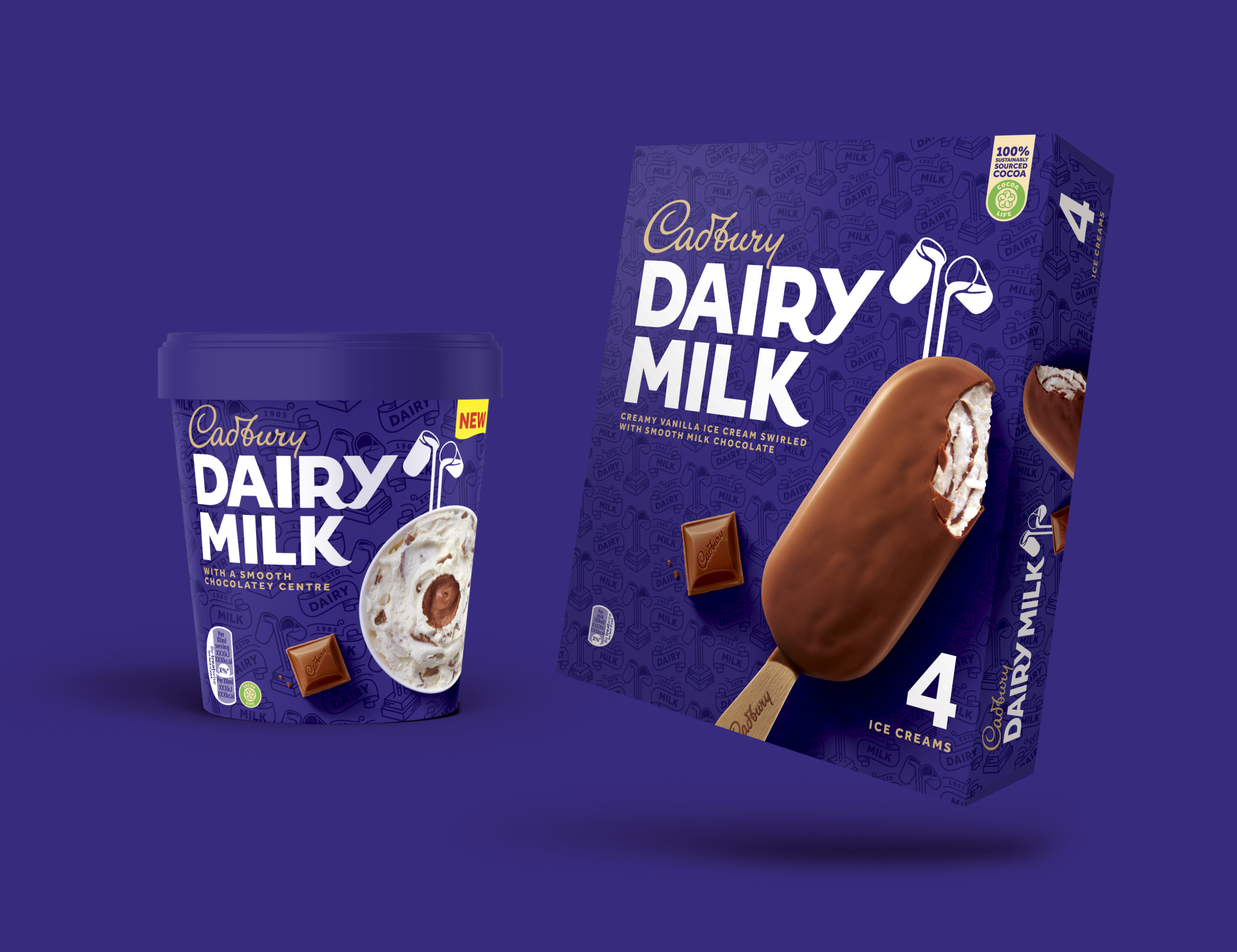
CADBURY – DAIRY MILK
It’s always great when Froneri brief us on a new project and none more so than the recent redesign of the Cadbury Dairy Milk Ice Cream packaging. From new photography to rolling the range out across several sku’s the team loved working on this!
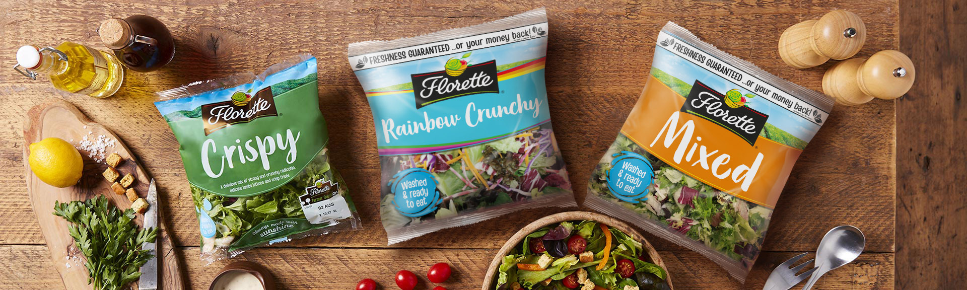
FLORETTE – TURNING OVER MORE LEAVES!
As summer has officially begun (hopefully the weather keeps up with it!!) we can enjoy even more time outside! What’s better for that BBQ than the new Florette Rainbow Crunchy salad? The new packaging follows on from the rebrand pictured here that we did for Florette and it’s great to see new lines being added to the range!
Written by: