Co-op’s Thoughtful Approach Shines Through
It’s put a spring in our step to see our Mother’s Day packaging design in the Co-op this year. We based the design story around craft materials, using a natural textured paper finish and three-dimensional paper cuts. This gives the range a homemade feel yet keeps it neat.
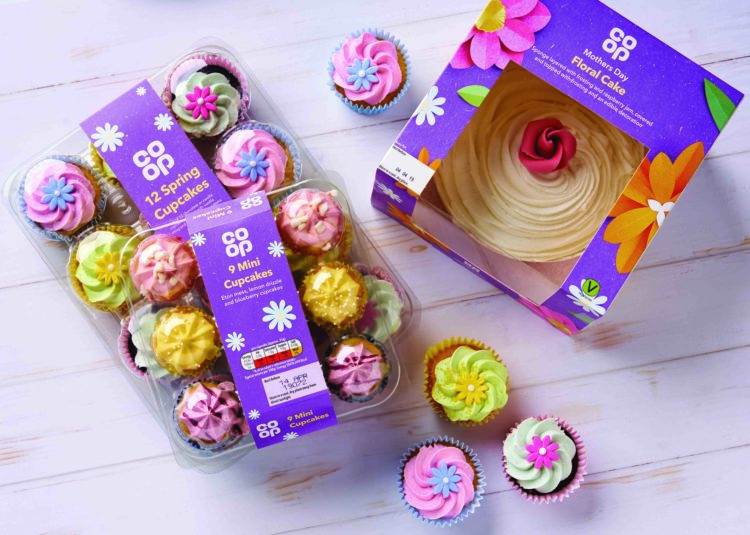
Mother’s Day is just one element of a complete spring campaign we created for the Co-op and the range includes a Floral Cake, ‘I Love You Berry Much’ sweetie jar, Spring Cupcakes and Mini Cupcakes inspired by mum’s favourite desserts. We used a springtime inspired pastel palette, theming Mother’s Day in purple with the Co-op logo in white and product names accented in light yellow.
The Floral Cake packaging design showcases our homemade theme with graphics of handmade paper cut flowers and leaves scattered over a texture-look purple background. Overhead photography on both sides of the box displays tempting imagery of the cake being sliced.
The personal approach continues with pale blue paper cut daisies used on both cupcake pack designs. Our daisy design is replicated in the toppers used to decorate the Spring Cupcakes – who could resist multicoloured pastel flowers on a swirl of vanilla frosting!
Our creative team set out to create a down-to-earth and personal feel to this campaign, drawing on a love of crafting and homemade gifts, reminding us that Sunday needn’t be about fancy things, just thoughtfulness and good times shared.
Written by: