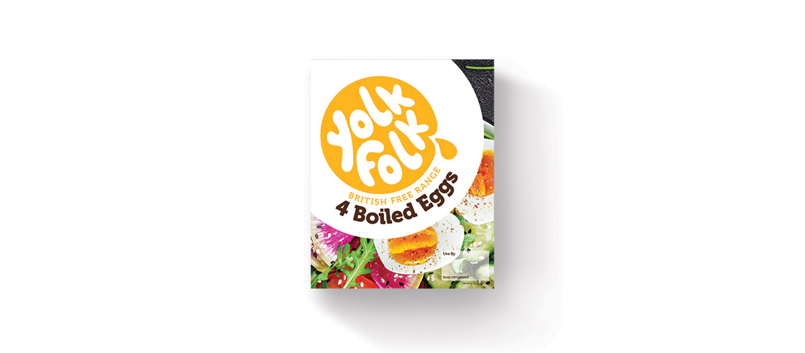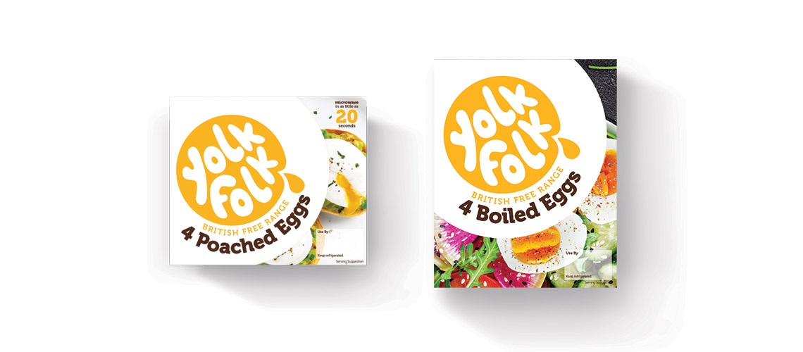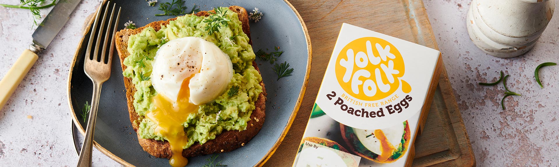
When we were asked to create the brand and packaging design for an innovative egg company, we couldn’t wait to get cracking.
A poached egg with a perfectly runny yolk is an art form. Dreamy on avocado on toast, but not so dreamy to make. So our client came up with a solution. No fuss ready-to-heat eggs that come out of the microwave with an oozy, golden yolk every time. Once the product was perfected, it was over to us to create the brand and design the packaging that delivered their unique proposition.
We kicked things off with brand name generation, and our copywriters landed on Yolk Folk. Not only did it convey the product benefit, it had tonnes of character and gave us endless ideas for where the brand could go. Before we knew it we had an exciting identity and a playful tone of voice. The packaging design followed, and featured a ‘yolk’ yellow to create stand out on shelf, and a die cut flap in the shape of a poached egg. When flipped up, the flap provided shoppers with a glimpse of the tasty eggs inside.
We’re delighted to say that the launch of Yolk Folk was a huge success. The brand has secured listings with the Co op, and there are further opportunities in the pipeline. Watch this space!