The popcorn category has been undergoing a revolution and Butterkist needed to continue to lead the way.
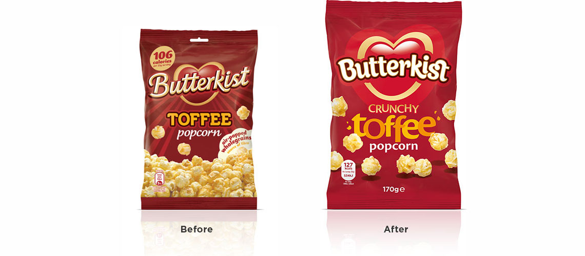
Butterkist is synonymous with popcorn; it's the market-leading brand and close to the heart of the British public. However the popcorn sector has been changing; the entry of new brands offering lighter options and the growing awareness of popcorn as a ‘healthier’ snack have seen a transformation in the category and Butterkist was starting to look a little dated.
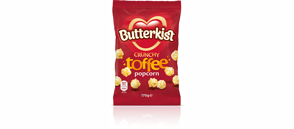
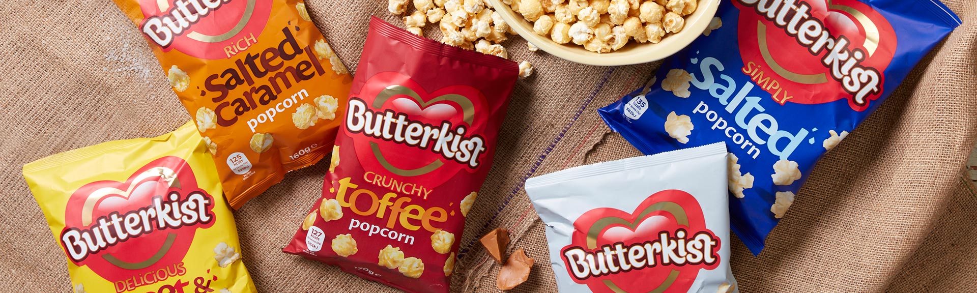
Following a lot of in-depth consumer research we quickly established that the brand was iconic and very much lived in a world of enjoyment. People could recall the identity, the strong red core colour and the loving heart with very little prompting; it was just a question of making it feel modern and in keeping with the times.
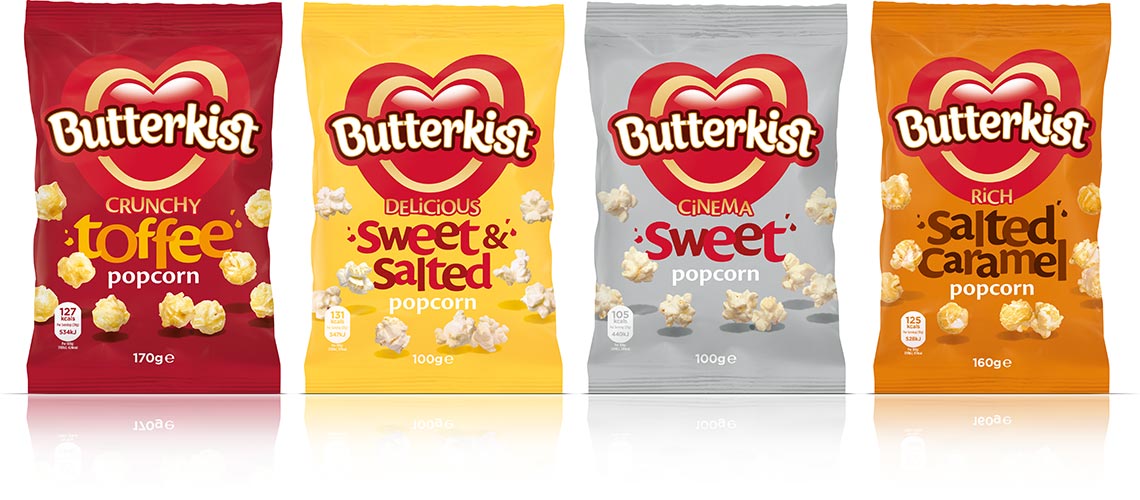
Taking on board the research findings we started to refine the identity whilst still retaining the heart and essence of the original version; the red was brightened to give the packaging a lift and the use of more emotive language and typography helped to convey the flavour cues. Further work was done on the differentiation between flavours with the introduction of strong colour blocks to give clarity and easy navigation across the range.