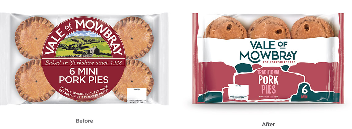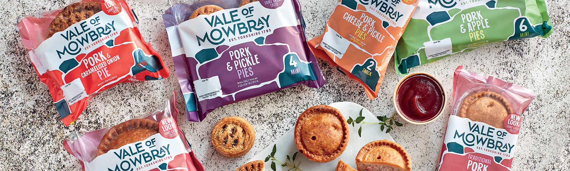
Over 200 years of pie making heritage needed baking into this well-loved brand’s new look.
Leading pork pie brand Vale of Mowbray approached us to help create a fresh new identity and give an updated and contemporary feel to the packaging of their iconic pies. This is ahead of some ambitious expansion plans as they look to revolutionise the ready-made pork pie market.
The rebrand, which was the biggest undertaken by the company to date, needed more than just a nod to their illustrious heritage - which can be traced back to 1795. They have proud Yorkshire roots and needed to encompass this history along with their forwardthinking present.
An injection of modernity was needed to deliver a new lease of life into the brand and fully tune into the tastes and demands of today’s discerning pie consumer amongst a crowded ready-to-eat market.
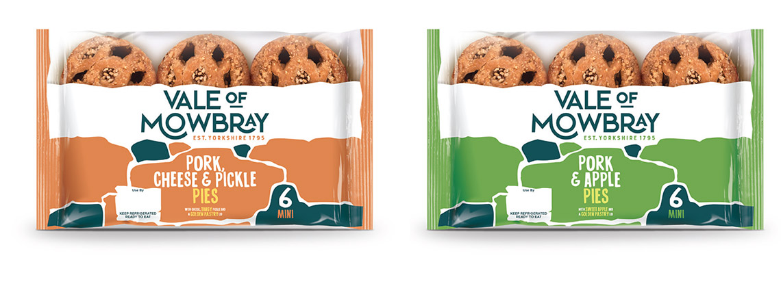
Our team used a modern suite of colours to really emphasise this evolution and as a visual marker to easily differentiate between their expanding range of flavours. A bold stonewall graphic was added which plays on the reference to Yorkshire as well as giving a nod to tradition, whilst the addition of a playful 1920s art-deco-style font delivers a bold, confident and established feel, giving that all-important shelf-stand out.