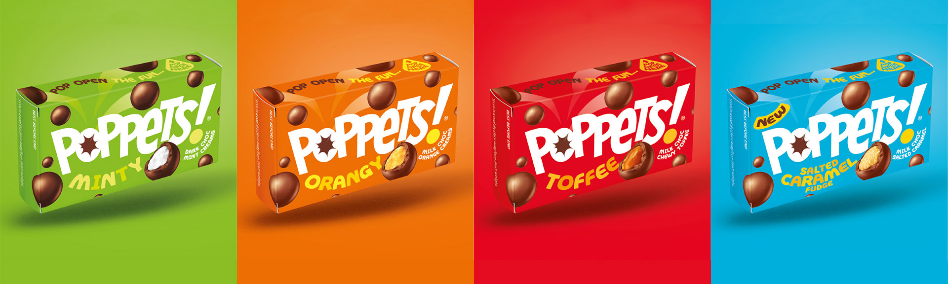
An old-school British icon, Poppets needed a brand refresh and reposition to keep up their market appeal.
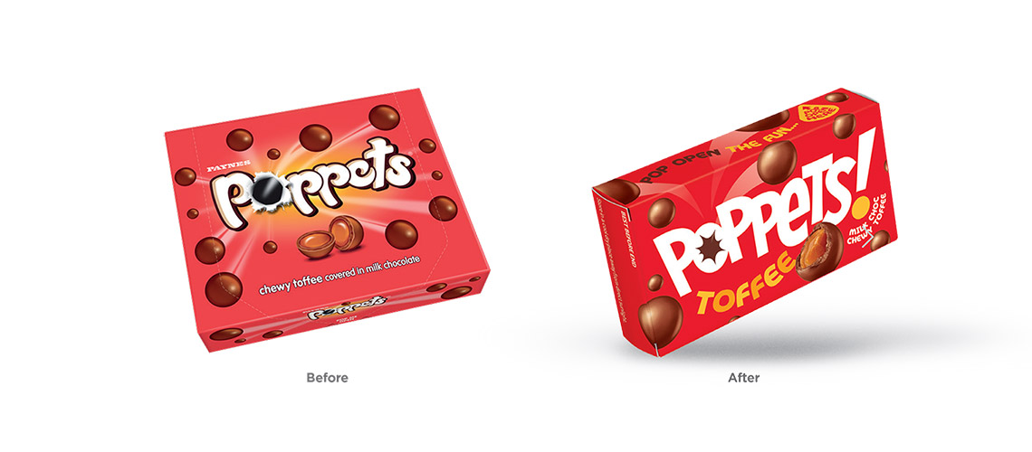
We were tasked with modernising this well-loved confectionery giant of our childhoods. The fresh new look and full rebrand has helped to improve awareness and increase shelf standout amongst a very competitive fixture.
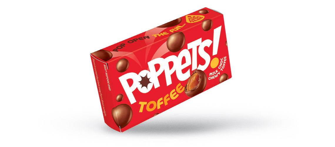
With a rich heritage dating all the way back to 1937, Poppets evoke full-on nostalgia for trips to the cinema with their bright colours and iconic box design which had remained largely unchanged since their launch over 80 years ago.
With Brits still chomping through 10 million Poppets per week, our challenge was to create a more contemporary look whilst retaining the important visual elements that we all know and love.
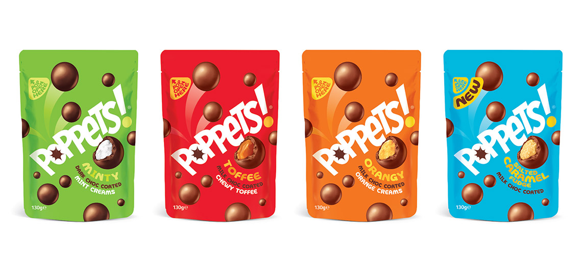
Our design team ramped up the fun by brightening up the original and very recognisable brand colour palette to improve their shelf standout, whilst still easily differentiating between flavours. We also added in a new playful and modern typeface to inject more character and help create a fresh, up-to-date identity.
Our inhouse strategy team worked on repositioning Poppets within the marketplace, highlighting the nostalgic elements whilst emphasising their updated, on-the-go ethos in a newly refreshed and engaging way and appealing to a whole new generation of Poppet fans!