How our distinctive new branding helped Saltaire cut through the noise in an increasingly busy beer market.
After a recent revolution in craft beer, the market was flooded with new brands. Saltaire already had some tasty credentials, but they were keen to strengthen their position with their audiences.
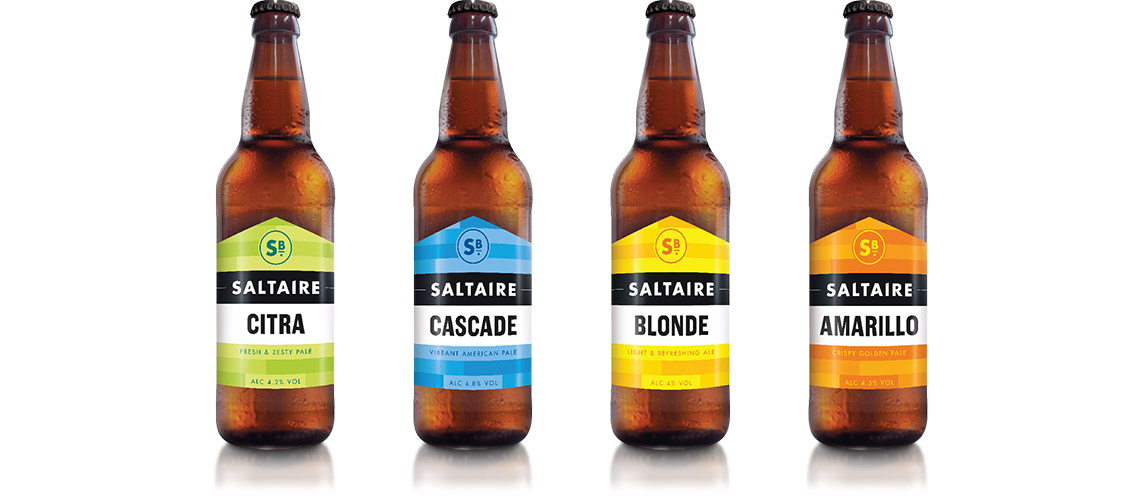
To complement their core range, they decided to introduce something a little more experimental. Something that would go down well with a completely new audience.
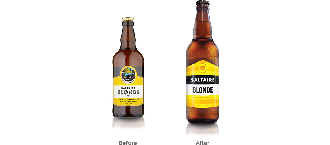
Our job? To distil what was best about the Saltaire brand and inject it with a contemporary feeling. It had to be distinctive. But the challenge was to ensure that it could bridge both the core and new ranges.
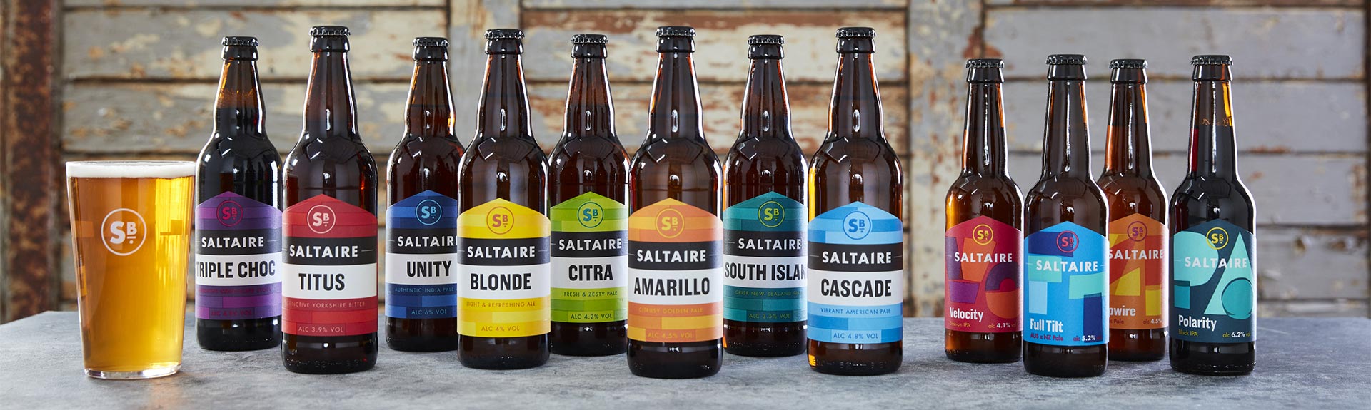
Once we’d established a new model and story for the brand, we started work on the identity, giving it a more contemporary feel with a nod to the characteristic street signs in Saltaire Village. The label design was inspired by the brewery house bricks, whilst the slant of the roof was mirrored in the lettering of the logo.
A bold use of colour helped us to cut through a busy category and helped with navigation. These were overlapped to give an overprint effect that reflected the brand’s experimental nature.
The result? A bold new design that brought character and cohesion to two different ranges. And created a distinct style across Saltaire’s marketing communication.