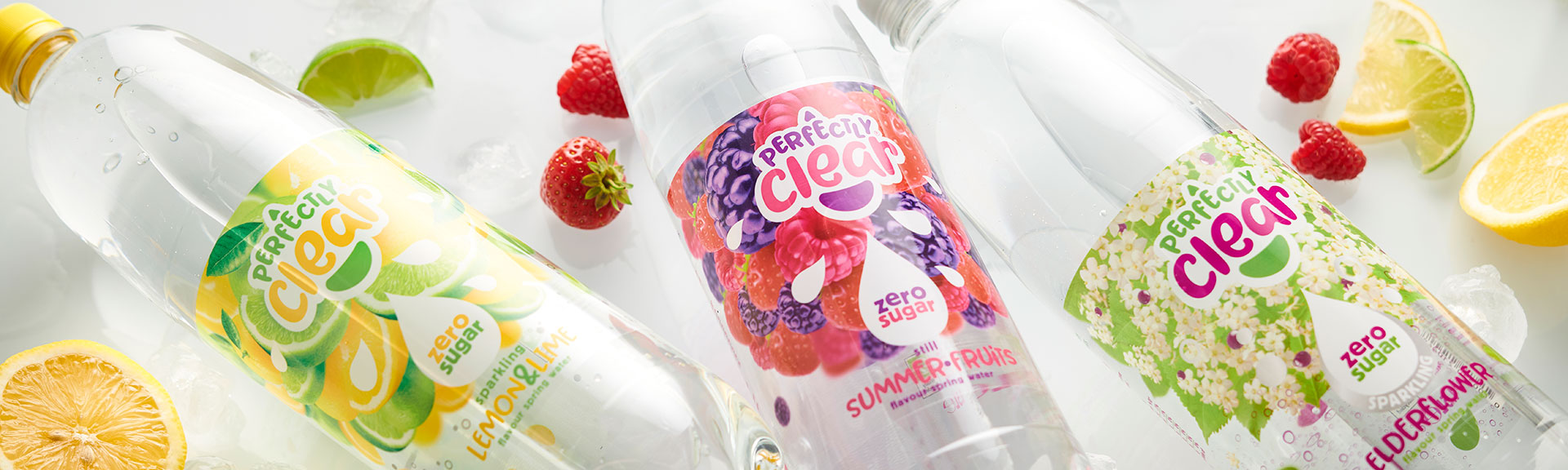
When Perfectly Clear reached out to us, we revived their branding and packaging design to make them the clear choice on shelf.
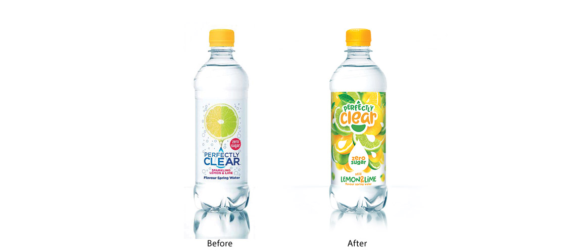
Clearly Drinks had ambitious plans to drive growth for their Perfectly Clear range and approached us to help redesign their existing brand and their packaging with a more family-focused look and feel.
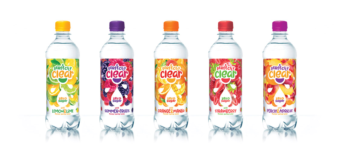
In this extremely complex and dynamic sector, the consumer is faced with a huge range of choice. So creating shelf stand-out was key. We focussed on delivering a fun, engaging design that clearly communicated the water’s fruity, sweet hit of flavour whilst maintaining the healthy message of zero sugar.
We began by refining the brand identity. We introduced a more playful typeface and enhanced the appearance of the water droplet that is so integral to the product and brand name. For the packaging design, we mirrored the taste experience by creating a characterful fruit design that wrapped right around the bottle. Not only did this help customers navigate the range quickly and easily, but it made sure the bottles cut through on shelf too.
The results speak for themselves. Following the rebrand, Perfectly Clear have seen fantastic growth year on year. And we couldn’t be happier about it. Pure and simple.