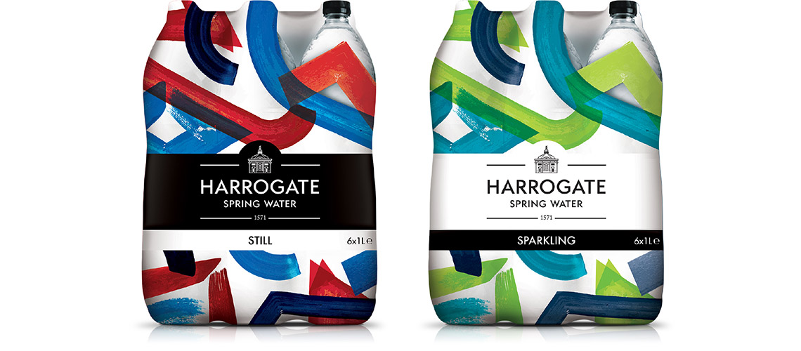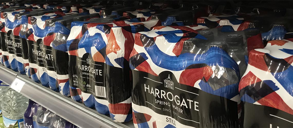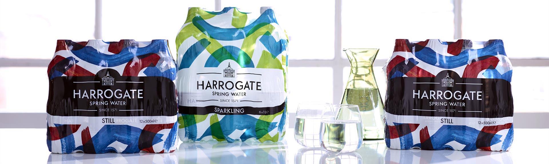
Bold and inspired shrink-wrapping for Harrogate Water gave their packs more standout on shelves.
Harrogate Spring Water wanted a new identity for their shrink-wrap packaging, something that would feel in keeping with the brand but give them a bigger impact on supermarket shelves.
In the bottled drinks market, fizzy drinks were stealing the limelight on shelf with bold confident colours. Our challenge was to break the mould with a fresh new design, but retain the symbolic connection with the brand’s history and authenticity.
So, we delved into Harrogate Spring Water’s past as a creative and artistic brand to create something that was both striking and avant-garde.
Harrogate was the first British Spa and was celebrated by the Victorians who built the magnificent Royal Baths and Pump Room. Using elements of the Turkish-inspired pattern from the baths, we redrew, reconstructed and rescaled it to create an abstract, bolder visual.
The resulting design combines tradition with a modern aesthetic, adding a stunning visual twist that grabs attention on shelf. The strong colour scheme uses red and blue layered shapes on the still water packs, and green and blue on the sparkling packs. It is strongly reflective of the brand’s illustrious spa story, underlining the brand values and attitude of Harrogate Spring Water.