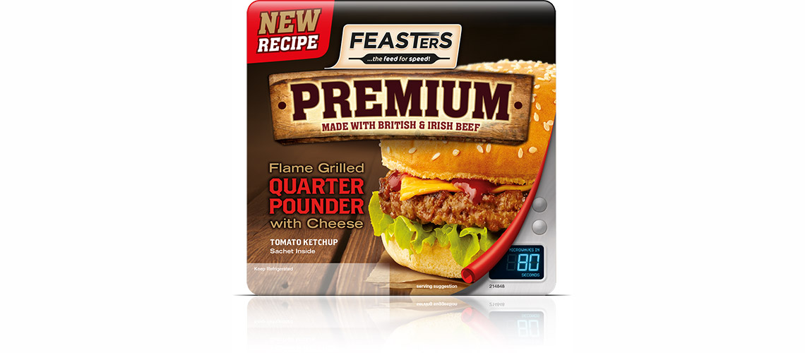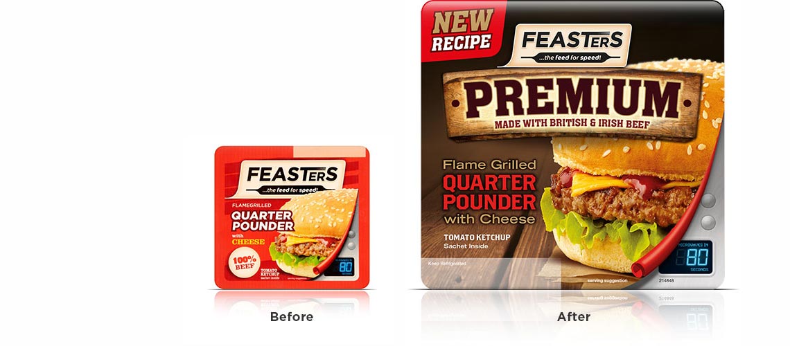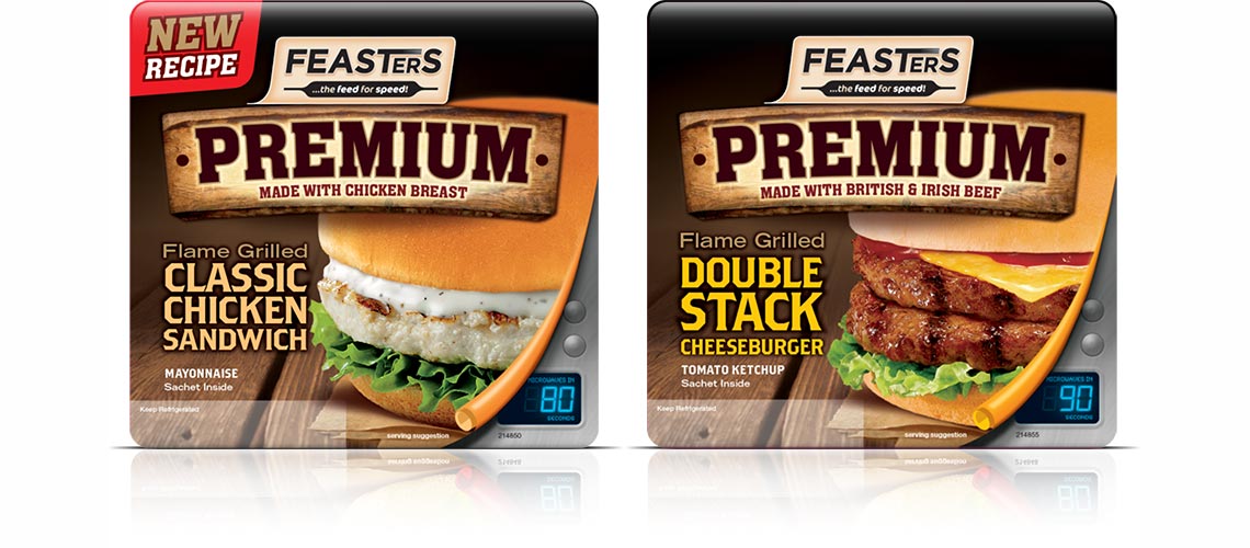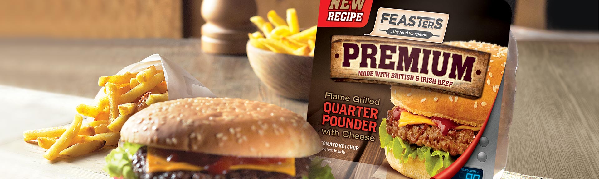
To make the Feasters branding live up to their promise, we made the packaging look as delicious as the product was.
In the world of microwaveable snacks, Feasters is a really well-known name. But there was a concern that the packaging didn’t deliver the quality and great taste that were the key reasons for purchasing.
It was vital to put the quality and taste proposition firmly at the heart of the design so we introduced the new ‘Premium’ branding which was supported by a strong product provenance message. It was then a question of introducing a darker colour palette and appetising photography to really push the taste cues. The addition of ‘flame grilled’ to the product description and a specific ‘new recipe’ graphic further enhanced the on-shelf appeal
Sales have gone up by 43% since the redesign was launched.