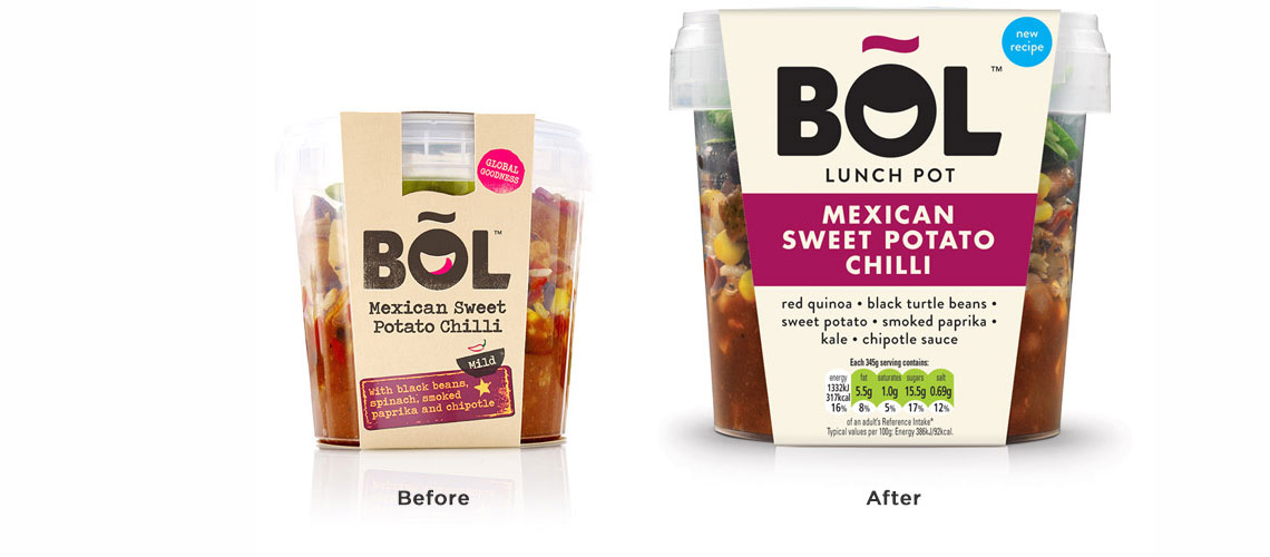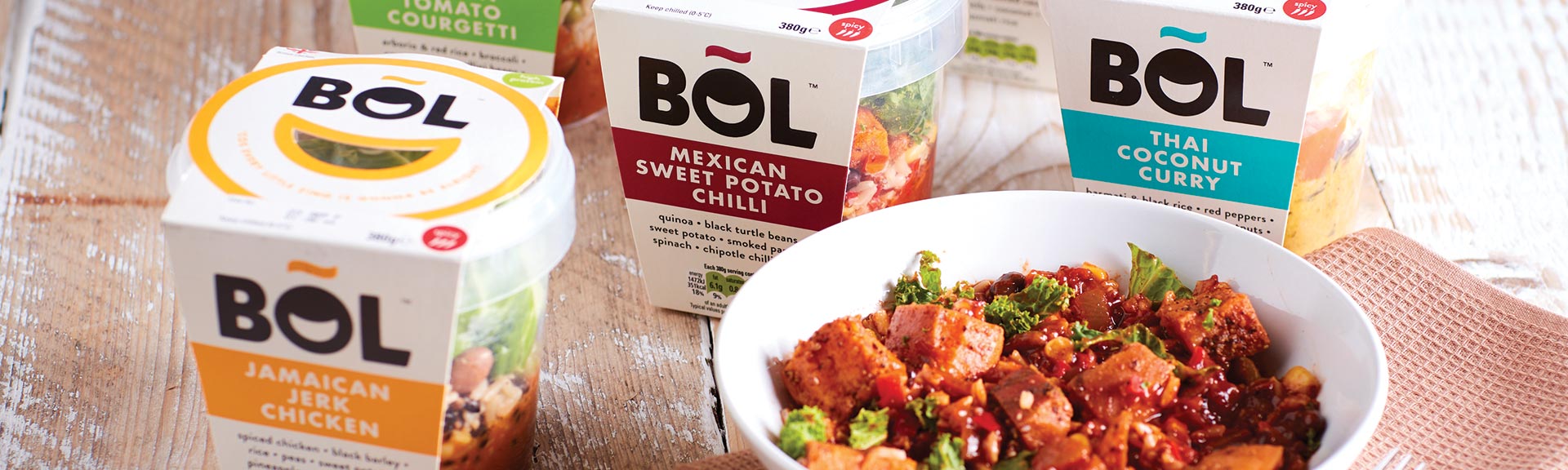
BOL packs needed more bite on shelf. So we refined their identity and made the branding and packaging tastier than ever.
BOL are all about clean, healthy eating and they make delicious fresh meals that are ready to eat whenever you like. The launch had gone really well but they decided now was the time to take stock, agree where the brand was going and find ways to make their products work a bit harder on shelf.
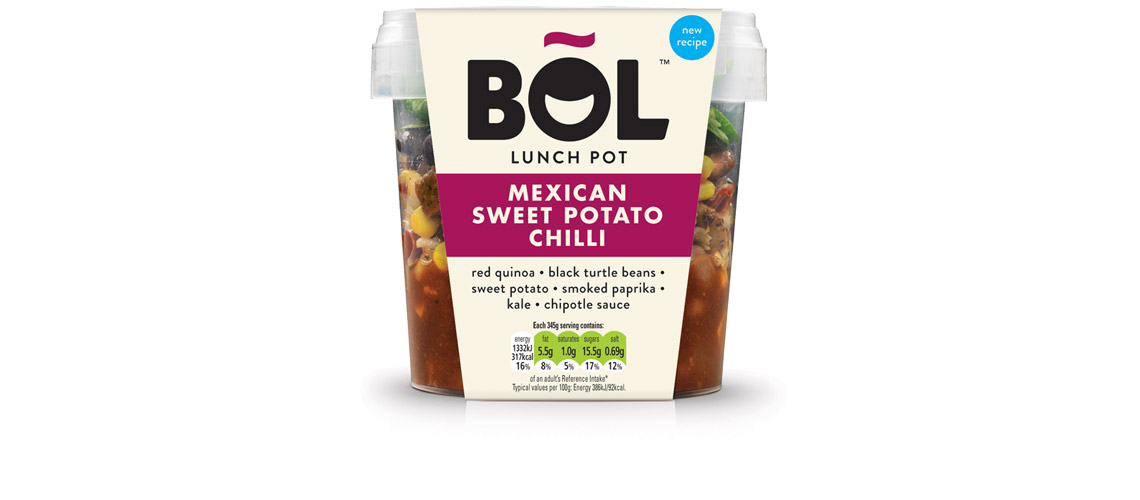
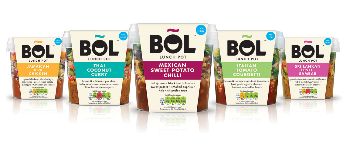
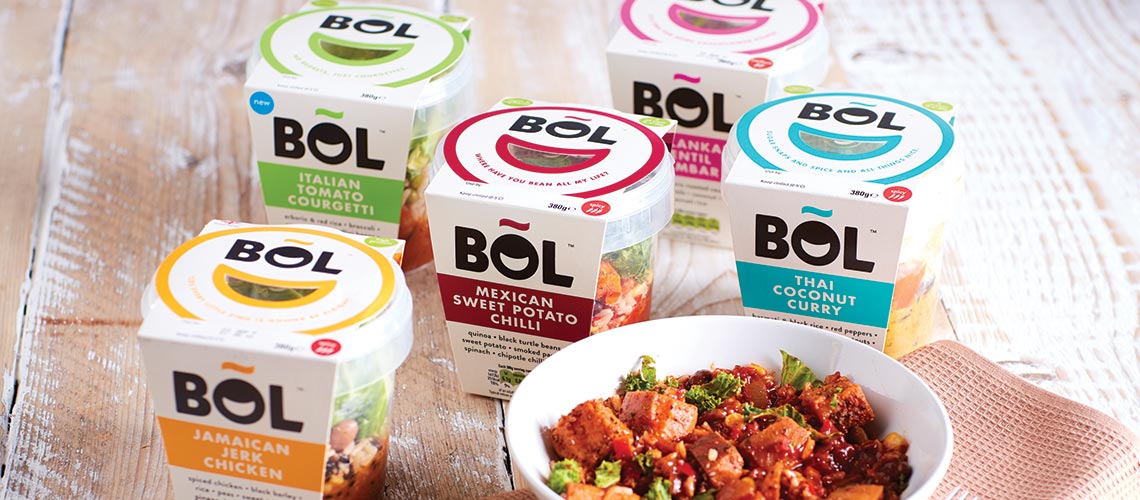
We looked at subtly refining the identity to give a cleaner look and feel that fell more in line with the proposition and then looked at the colour palette, replacing black with off-white and introducing strong, bright colours to ensure clarity and ease of navigation. Our in-store research also highlighted the fact that quite often it was the top of the pot that was most visible, so we took cues from the identity to develop a die-cut, emoji-style smile that added personality and delivered great standout on shelf.
Following the success of the lunch pots, we worked with BOL on the design of the packaging for the new salad jars and dinner bowls.