When we were asked to evolve a successful brand with 500 plus products already performing well, we used insight and stories to raise the game.
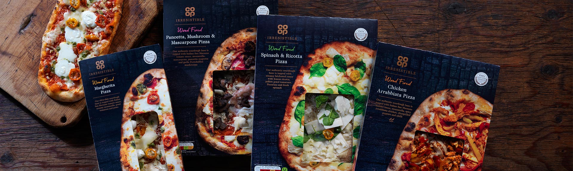
We’re often asked to resuscitate a brand that has become fatigued. You don’t have to wait until a line is underperforming though, as Co-op found when they asked us to look at their already successful Irresistible range.
Co-op’s premium range was performing pretty well but they wanted to improve brand recall, differentiating themselves from other premium own label and wanted more space between their core and premium products.
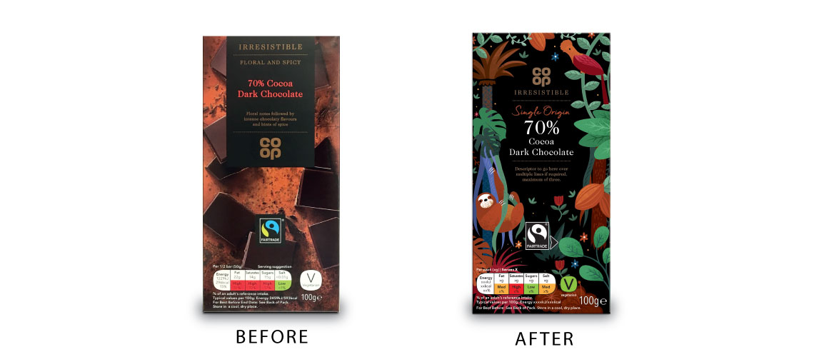
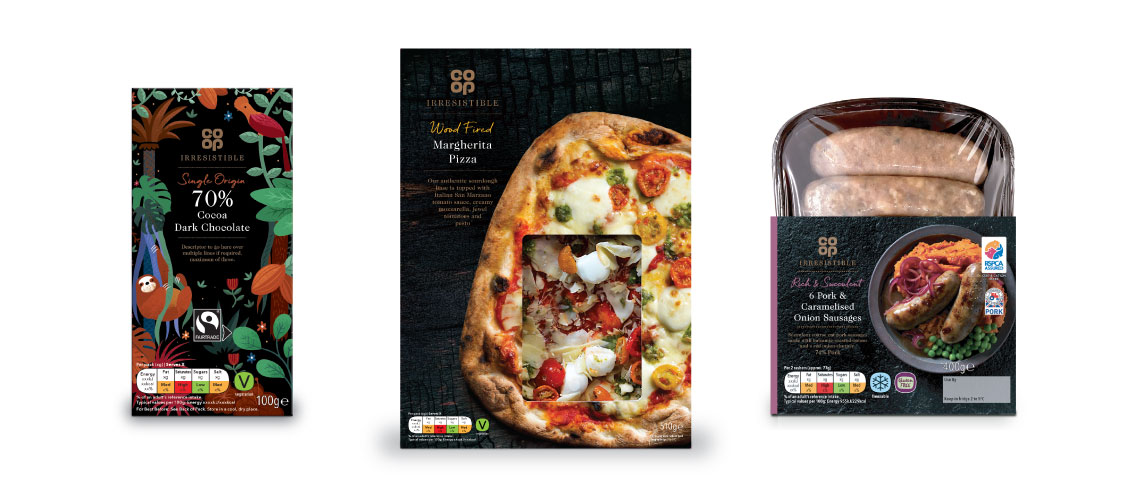
For us, the process was business as usual – we just did what we always do. But for Co-op, it was a big step on. We got straight to the heart of what makes each product ‘Irresistible’ – and treated each category separately. Previous guidelines had been quite single minded and ridged. Not ideal for a range of 500+ lines. Who wants their pizza to look like their chocolate?
So, we dived into customer insight and occasions, using stories to bring products to life, and design to inject character and give it the stature it deserves. We also proposed locking up the word Irresistible with the main Co-op logo to build on recall and recognition of the brand.
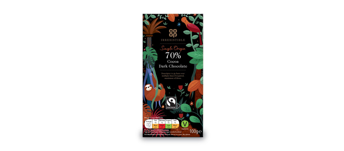
We’ve relaunched the entire Irresistible range with a whole new approach to photography, with designs that tell a story – and celebrate occasion.
The Irresistible chocolate alone have seen an 8% uplift in sales since redesign.
After all premium means Premium.