All our Christmases came at once when the Co-op asked us to design the packaging for their special festive products.
It doesn’t get any more exciting than designing the packaging for an iconic brand like the Co-op. Except when it comes to creating their packaging for Christmas.
The Co-op briefed us to create a strategic design that would work across their different ranges with one consistent festive theme. Plus, the designs needed to acknowledge their ongoing commitment to conscious consumption and plastic reduction. Quite a challenge, but one we were eager to take on.
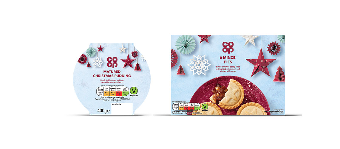
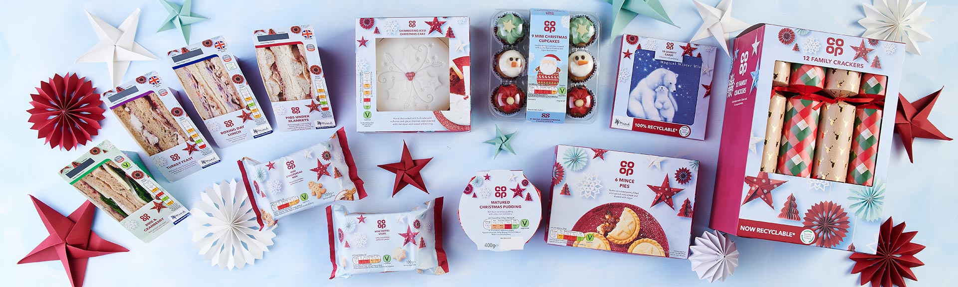
Working closely with Co-op's packaging design team, we explored various design directions before taking inspiration from the hygge and Scandinavia trends and creating a 'Frosted Fjords’ theme which encompassed elements of nature, folklore and minimalism.
The festive designs were presented to a focus group who loved the paper snowflake theme with its clear, informative design and festive-fun feel. The paper snowflakes also reflected the Co-op’s approach to reducing plastic.
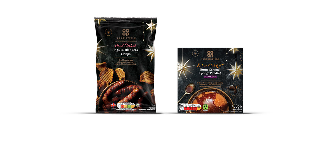
To make the creative work across the broad spectrum of the Co-op’s ranges, we adapted the design elements for each specific brand. For their core range, we used colour to differentiate between the 'Free From’ and Vegetarian lines. For the novelty range, we created Nordic-inspired characters to bring the products to life. And for their premium "Irresistible" range, we used dark colours and metallics to give a high-end feel.
Caron Moore, Design Manager at The Co-op said: "Our focus for the festive season was to enhance the feeling of community Christmas spirit with our chosen design theme and the CHILLI team have been able to interpret and intertwine these themes with our packaging and really bring those ideas to life".
The result is a beautiful range that will sing on the shelves during the festive period.