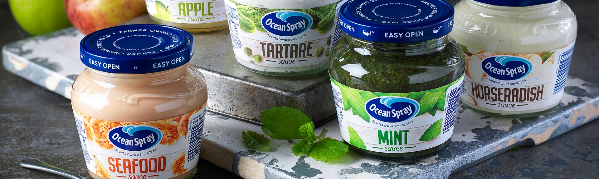
Known for making tasty Cranberry sauce, Ocean Spray wanted a fresh approach to packaging for its new condiment range.
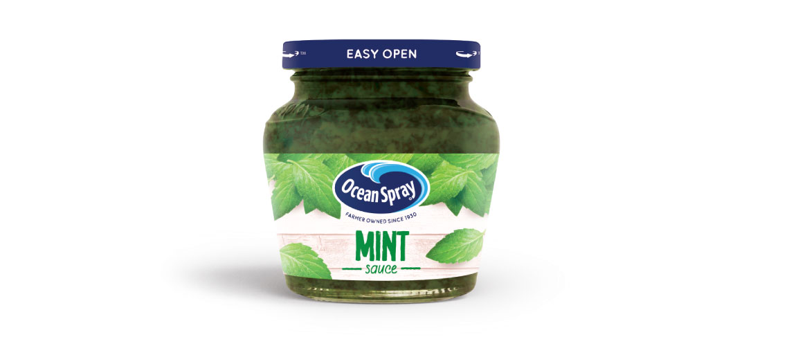
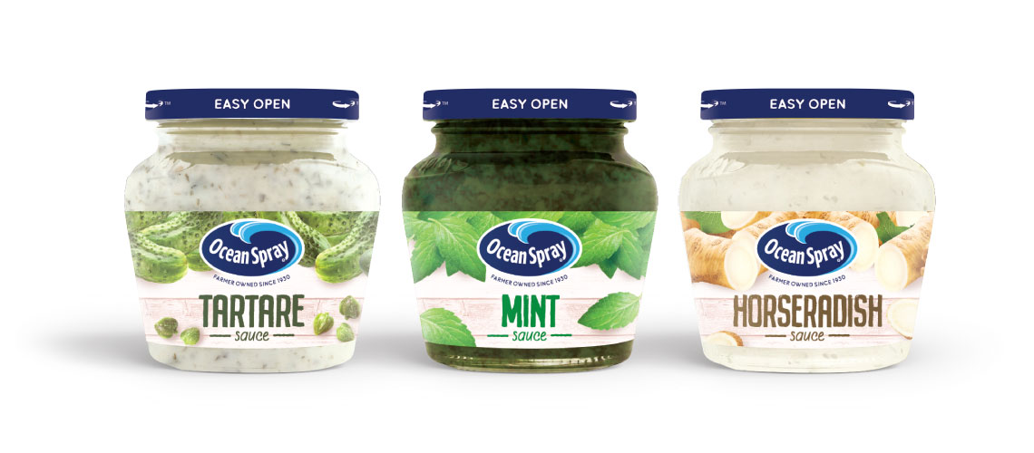
When Ocean Spray decided to launch five new sauces, we were definitely on board. Best known for its cranberry sauce, Ocean Spray wanted to branch out. They had an exciting new range of products including apple, seafood sauce, mint, tartare and punchy horseradish.
We needed to retain the synergy with the current Ocean Spray branding. We also had to maintain the brand essence of being wholesome and authentic, whilst highlighting its unique taste. Making sure each new variety had great shelf presence goes without saying.
The brief was to keep the distinctive glass jar shape, which is synonymous with Ocean Spray. Pushing the natural ingredients was key, so we suggested a smaller wrap around label to showcase the tasty sauces. Chunky apple pieces, vibrant mint leaves and the speckles in tartare sauce were clearly visible, increasing appeal. We also added bright ingredient flavour cues across the top, which gave the logo a great vibrant background that prompted the freshness and ensured the logo popped out.
It was all topped off with the Ocean Spray iconic blue lid. It’s proved a fruitful addition to the Ocean Spray range with Cranberry being updated now as well.