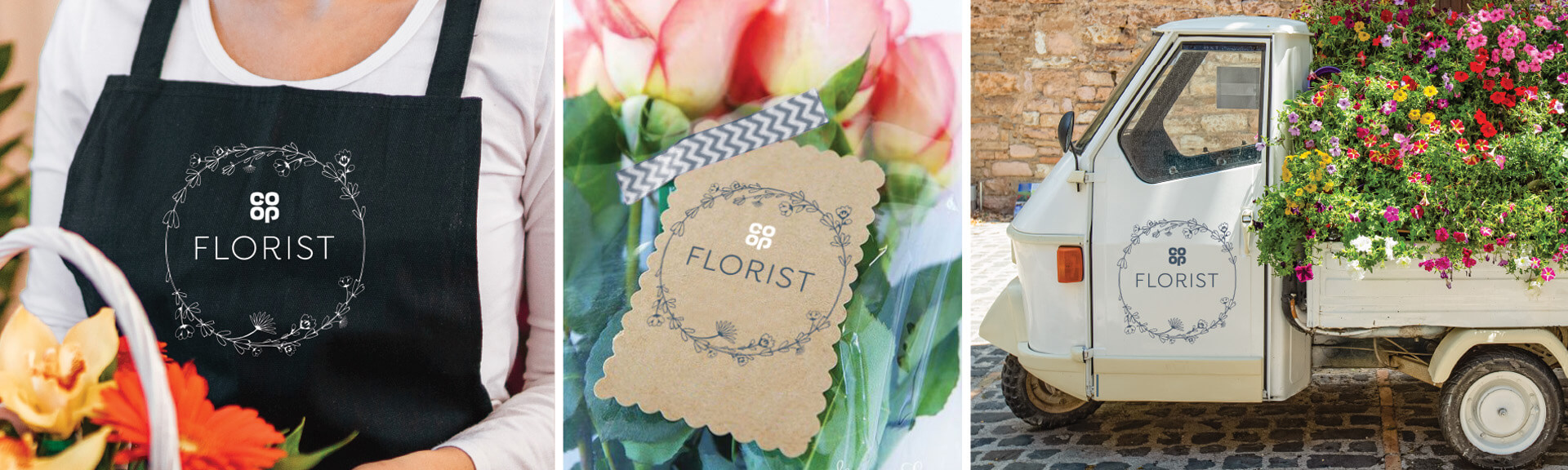
With a clean, contemporary refresh, we showed that supermarket florists could be more than just a place for panic purchases.
Flowers are often the first thing shoppers see when walking into supermarkets. Having a huge influence on a customers' perception of the store. First impressions count. But often customers are greeted by drab, black buckets filled with daffodils. It was time to change things up.
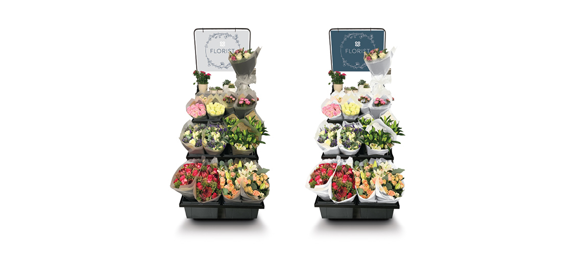
We wanted to turn Co-op into a destination for flowers and plants. One inspired by the bright, bustling flower markets of Europe but that still feels proudly Co-op.
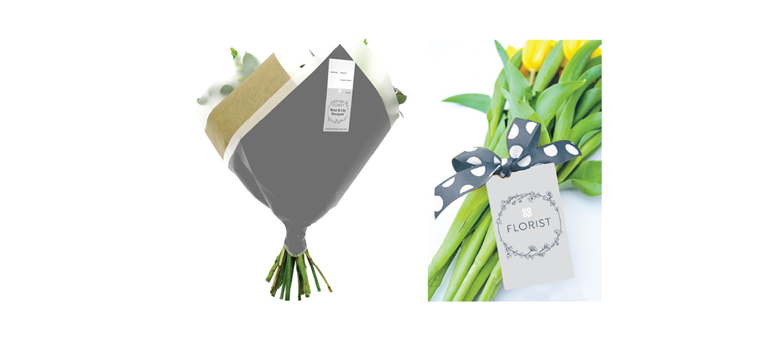
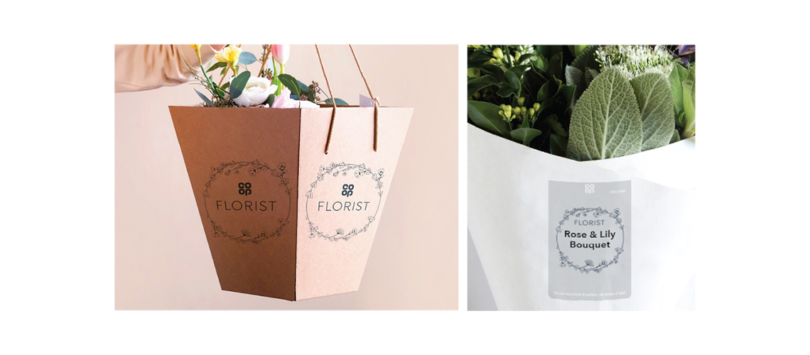
We started with a simple, modern logo that let Co-op Florist stand out in store. The logo's floral pattern then became the brand's signature, featured across everything from point of sale to packaging. With clean, rustic designs, we let the flowers be the hero. Giving shoppers a charming welcome to stores.
We also looked at how it could look in the future including wooden display stands, fresh colour palettes, and neutral paper wrapping which would continue this contemporary feel.