Ringtons

Bringing community spirit to the forefront

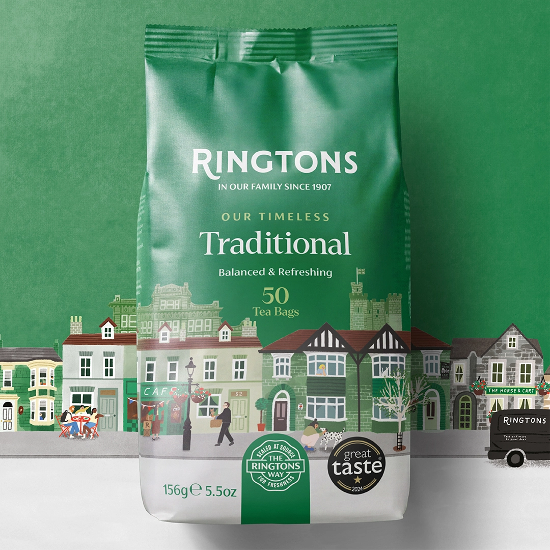
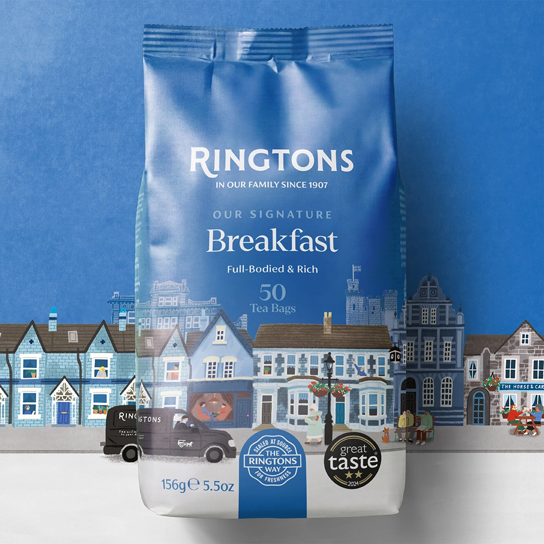
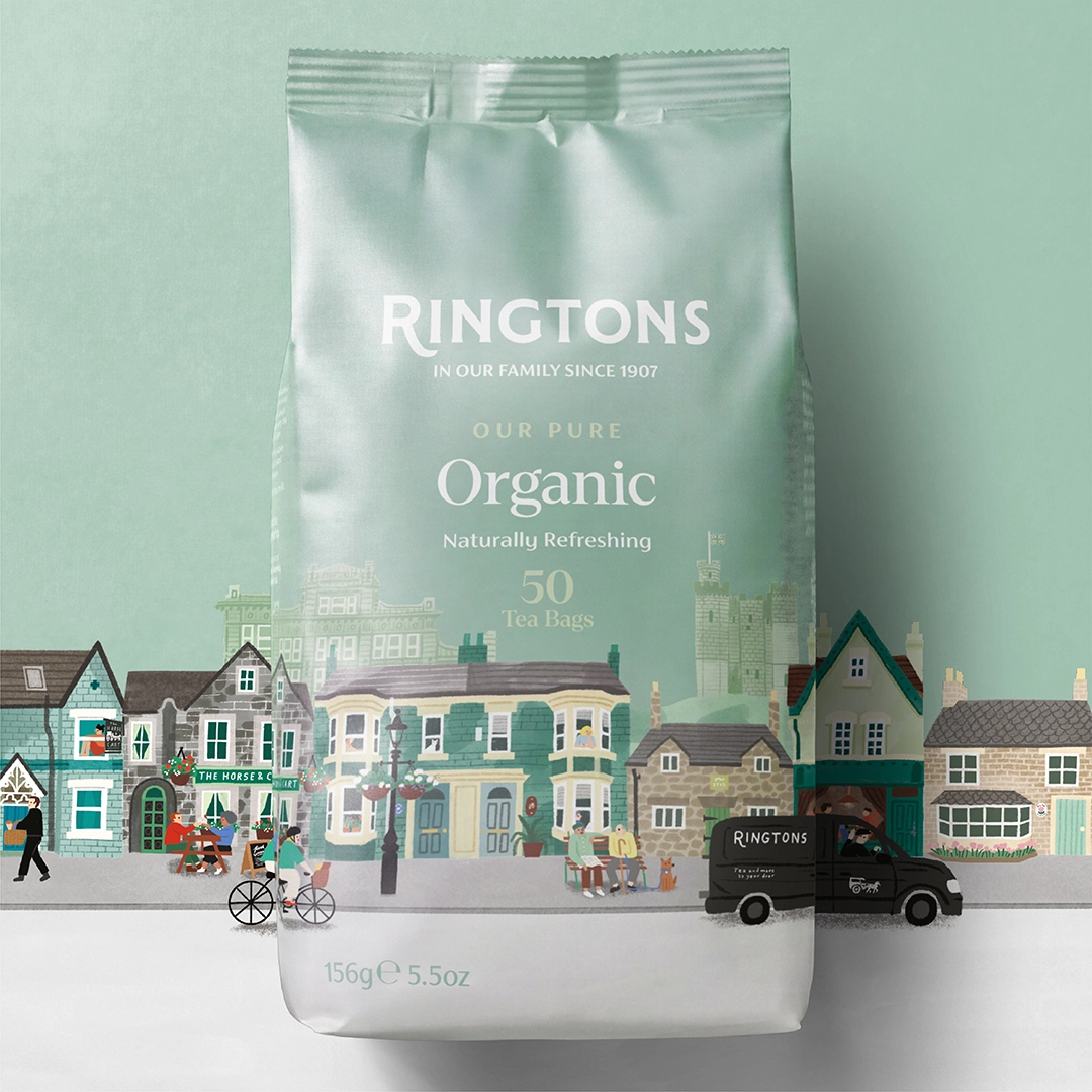
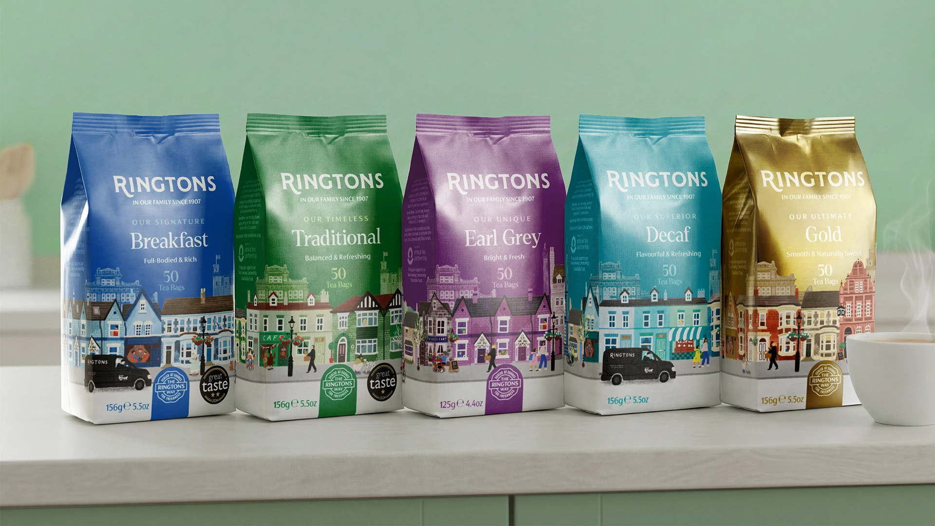
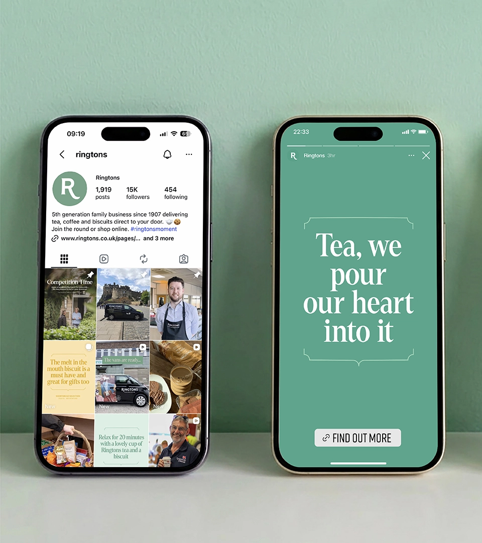
Ringtons has been dropping tea at people’s doors for generations, building a massive, loyal community. But their old packaging looked totally corporate and cold. It completely missed the point of what makes them special: that friendly, human connection between the driver and the customer.

Ringtons superpower is community spirit and shared British rituals. The packaging didn't need flashy corporate logos, it just needed to feel like a warm, welcoming neighbour.

  • BRAND WORLD
  • PACKAGING DESIGN
  • COPYWRITING
  • ARTWORK

We based the whole strategy on
real human connection. No
marketing fluff. We decided to use
custom, storytelling illustrations
that show the actual people behind
the brand. The plan was to make
every pack feel personal.

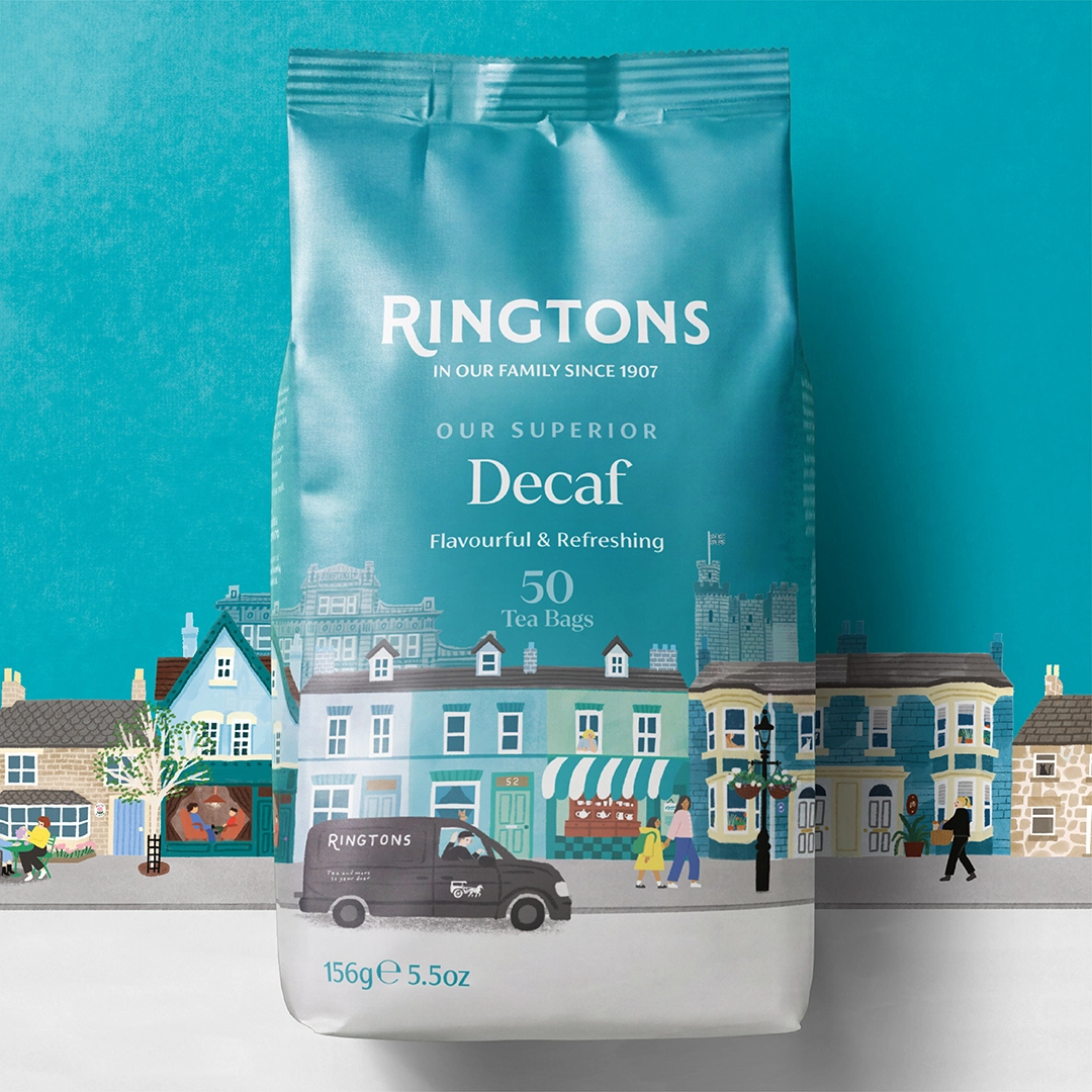
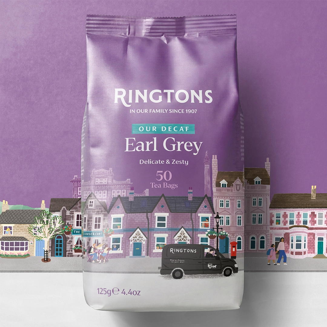
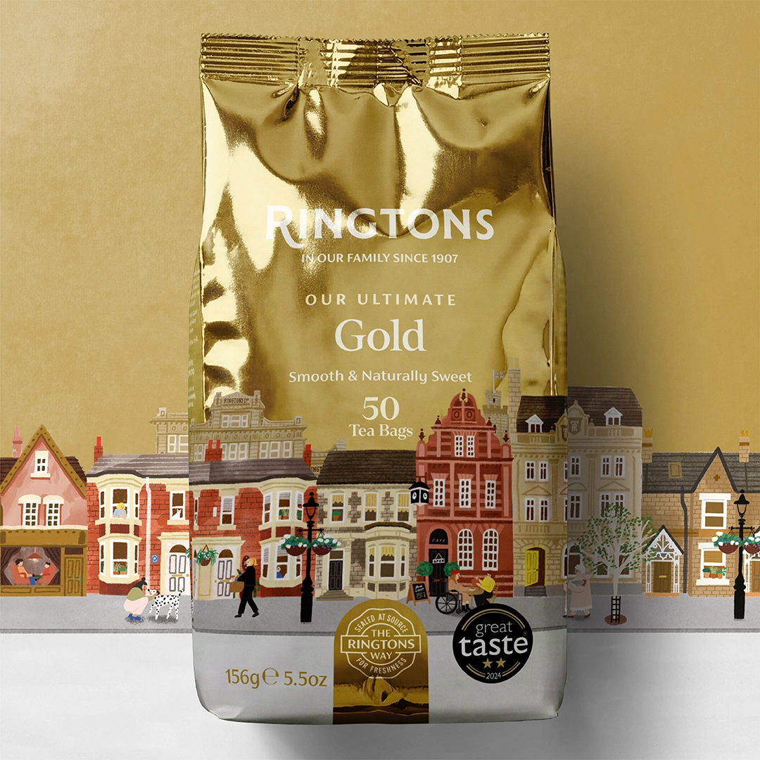
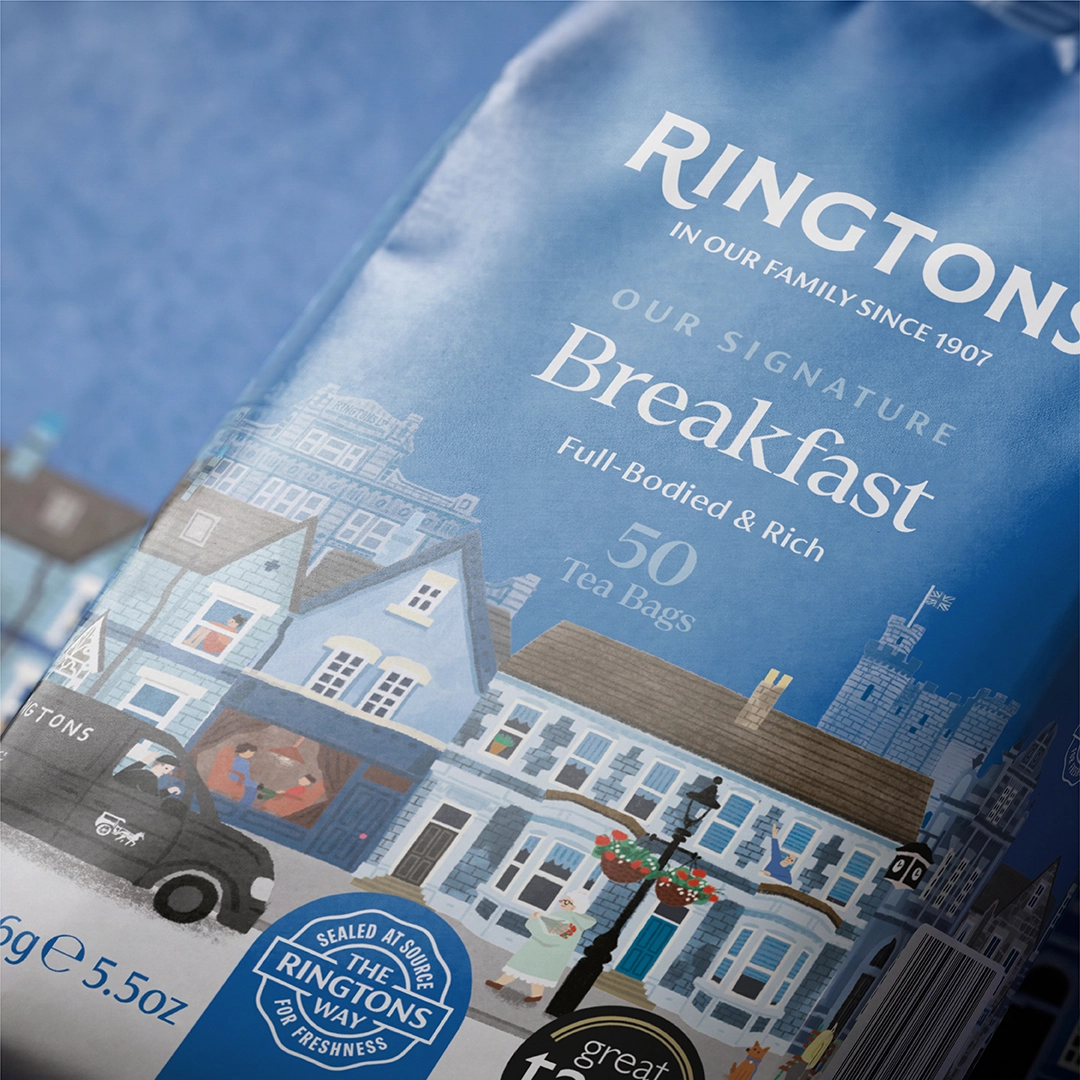
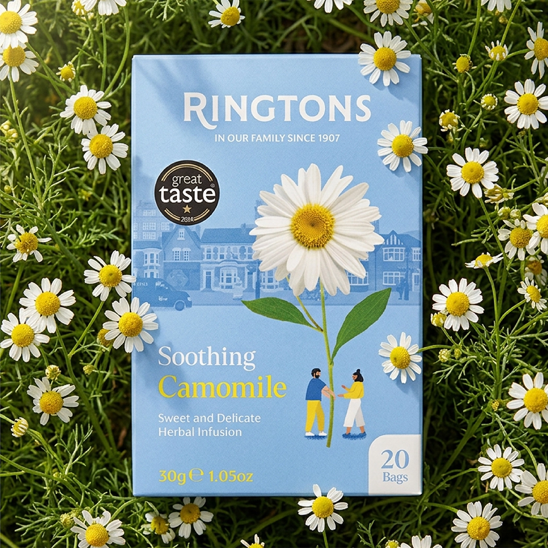
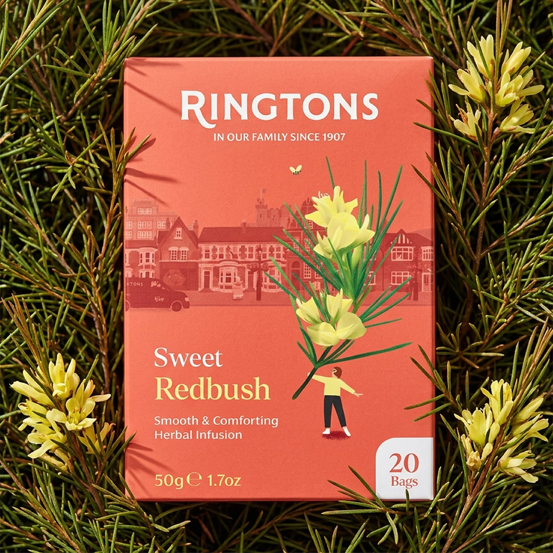
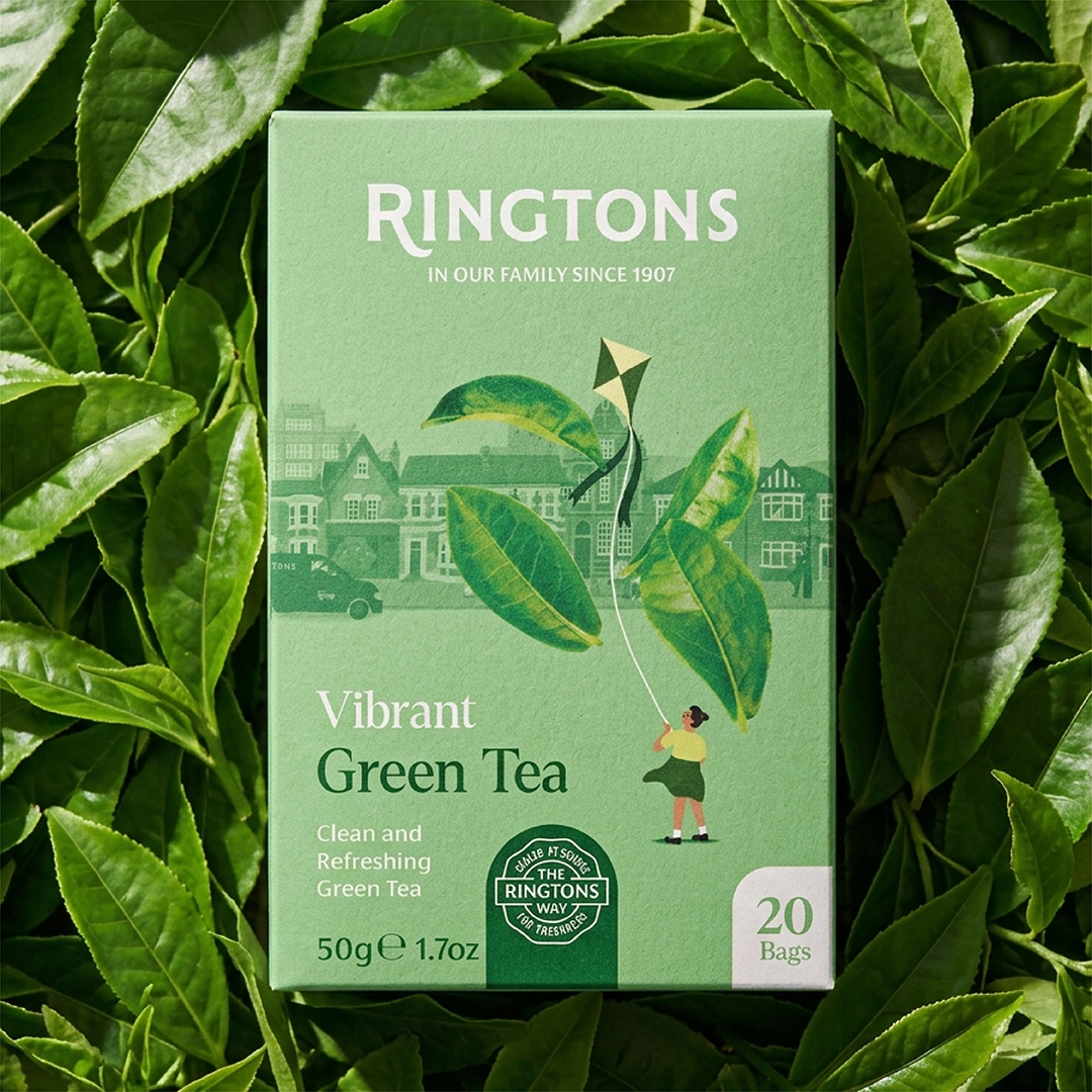
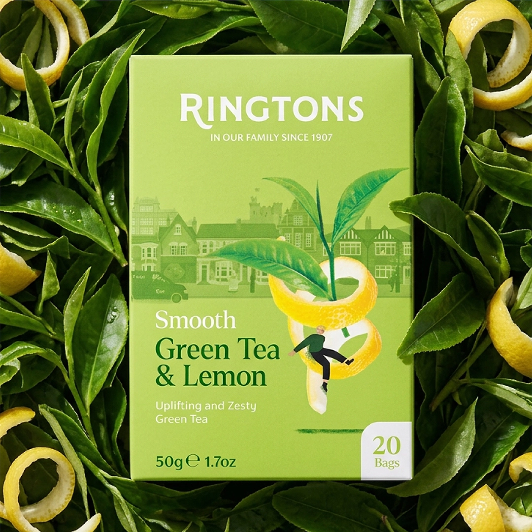
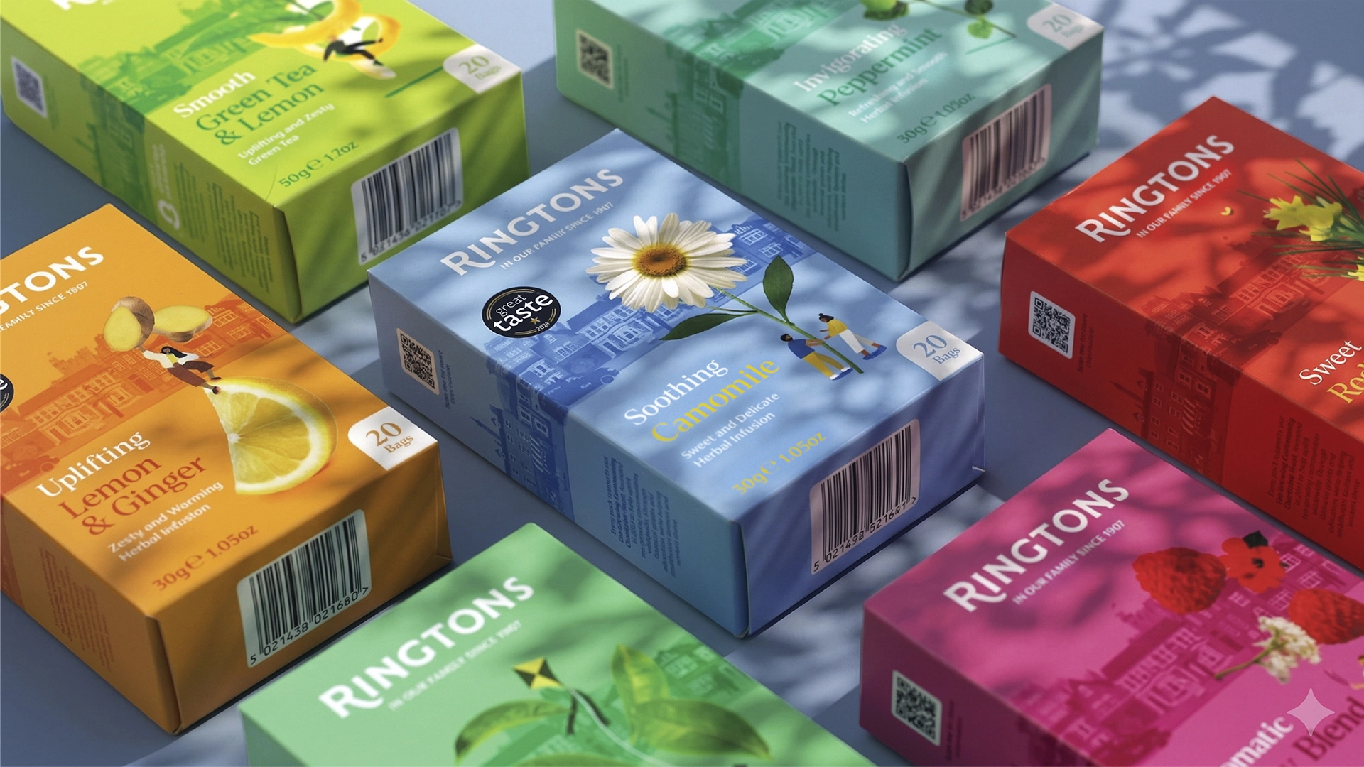
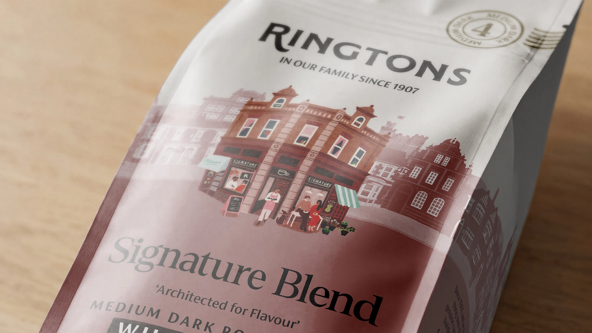
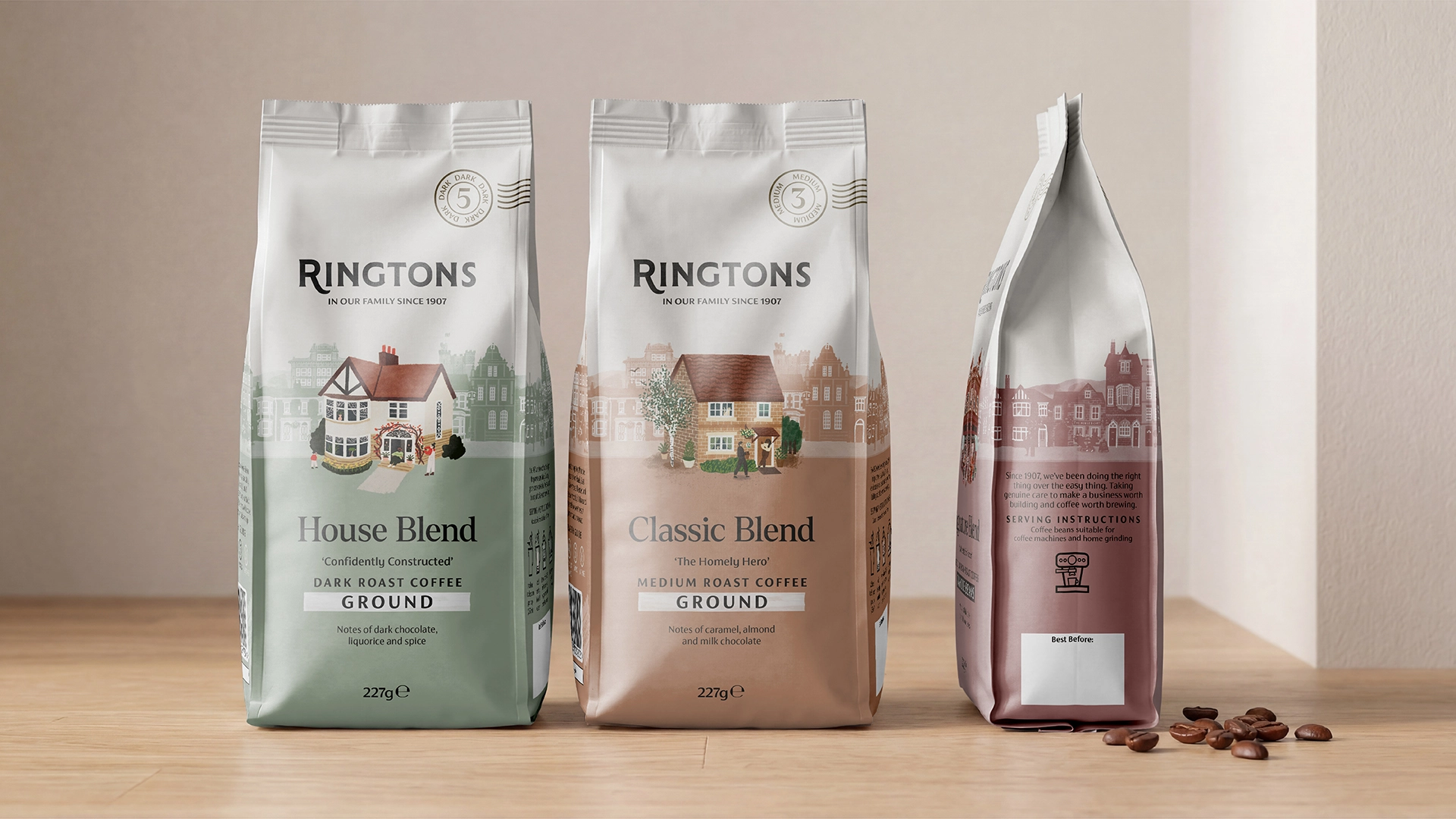
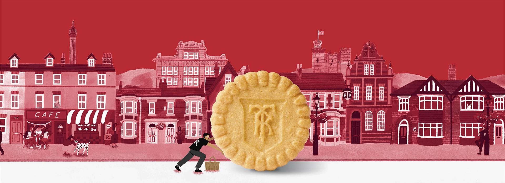
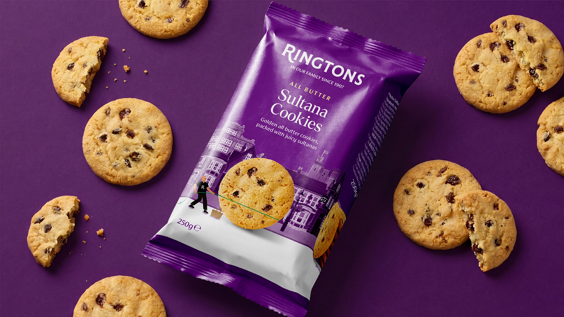
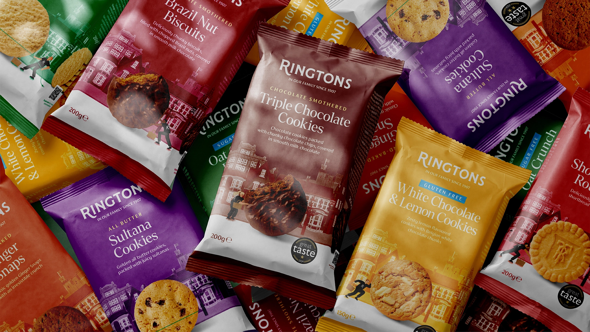
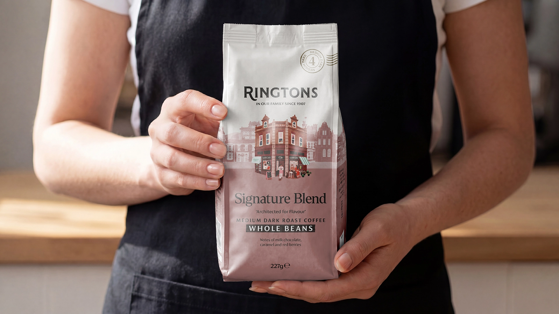
We completely binned the sterile, boring look and we put livelyillustrations of local neighbourhoods and real people right onto the packs. It’s a clean, modern design thatactually says something about thecommunity it serves.

The new range doesn't just look great on a shelf; it actually feels like Ringtons. Sales went up becausecustomers recognised the brand's true soul. By celebrating their own people, they modernized thelook without losing an ounce of that old-school neighbourhood loyalty.


The new range doesn't just look great on a shelf; it actually feels like Ringtons. Sales went up becausecustomers recognised the brand's true soul. By celebrating their own people, they modernized thelook without losing an ounce of that old-school neighbourhood loyalty.