Moving past diet culture: Refreshing an FMCG classic for a new generation
Written by Elena Orsi-Cunningham, one of Chilli's Account Managers with an FMCG design passion.
Chilli recently completed a packaging redesign of Princes’ Mug Shot range. Now it’s out there on the shelves, we couldn’t be prouder of our work!
If you’ve walked down the instant hot snacks aisle recently, you might have noticed something different. A burst of bold colour, a cleaner silhouette, and an undeniable energy radiating from the shelves.
Princes has officially unveiled the newly refreshed Mug Shot pack design for their sachets!
Shifting the mindset
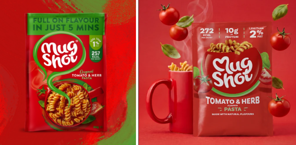
As the instant snack world has evolved, it became clear that Mug Shot needed to redefine its place on the shelf. For over a decade, Mug Shot was the ultimate go to for anyone on a low calorie diet. During its peak popularity, the packaging was incredibly functional, famous for those bold, unmistakable front of pack roundels shouting "Less than X calories!".
But times change, and so have consumers. We listened closely to feedback and recognised that younger shoppers were actively turned off by diet language. Meanwhile, newer competitors with trendier branding were starting to steal the spotlight. Mug Shot didn’t just need a facelift, it needed a fundamental shift in mindset.
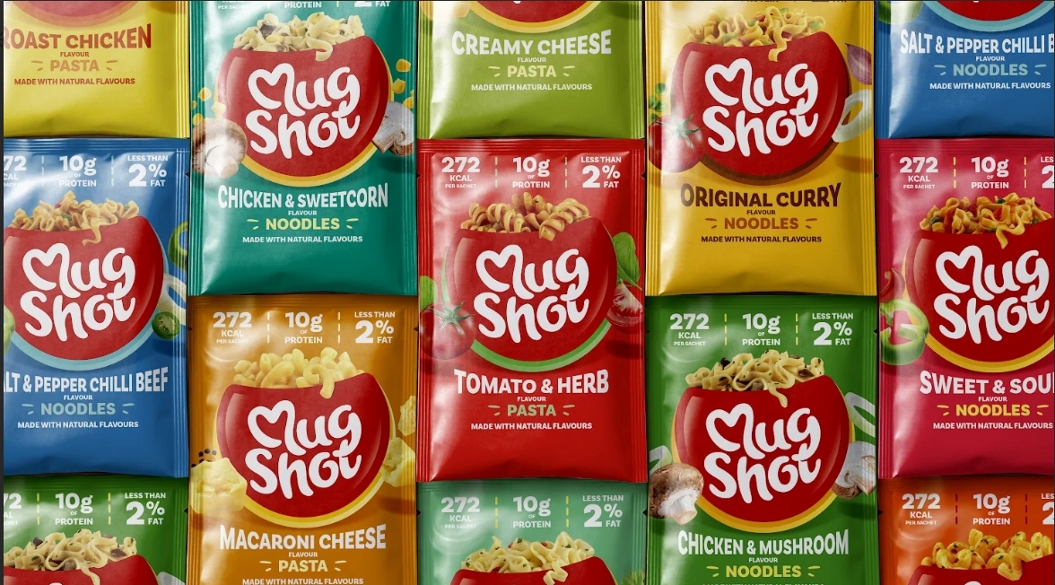
The new packaging puts the brand identity back where it belongs: right at the heart of the design. Mug Shot is now front and centre. By shifting the focus away from restrictive calorie counting and leaning into vibrant, dynamic ingredients, the design is cleaner, more appealing, and packed with shelf standout.
The result is that consumers no longer view it as a sad diet food you eat because you have to, but as a comforting snack you actually want to eat. It’s the perfect pick me up whether you're a busy office worker, a parent on the go, or just someone needing a quick fix between life's responsibilities.
The design challenge
From a design standpoint, when a brand possesses such iconic equity, you can’t just throw it away. Chilli had a classic FMCG design challenge to solve: How do we protect heritage brands assets while completely modernising its look? We needed to ensure instant brand recognition while entirely shifting the vibe.
We’ve moved away from the busy, diet centric look of the past and we've embraced a bold, modern aesthetic that puts the brand and taste right at the centre of the shelf. While maintaining an immediate connection to the original brand, our goal was to create a look that feels young, vibrant, and focused on nourishment, which is exactly what our audience needs.
Why the new look works
Here’s a breakdown of how the new sachet design brings our feel good formula to life:
- Iconic logo: The iconic Mug Shot logo is now inside a central, playful mug-shaped graphic. This way we have cleaned up the front of pack and focused the attention on this centralised logo while showcasing the product and the taste.
- Great flavour: Close up microphotography of the product now zooms right in to showcase the delicious ingredients, significantly boosting flavour appeal.
- Clean nutrition dashboard: We decluttered the top of the sachet. Now it features a streamlined, easy dashboard that clearly showcases what you get from it: Calories, Protein, and Fat content. It’s transparent information at a single glance.
- Elevated colour palette: We’ve updated and elevated our colours into a more premium, modern palette that stands out and connects with today’s consumer.
What do you think of our vibrant new look?
Which flavour are you hunting down on the shelves first?
Explore the full Mug Shot range here and if you have a diet-culture brand that needs reinvigorating on the shelf, get in touch!