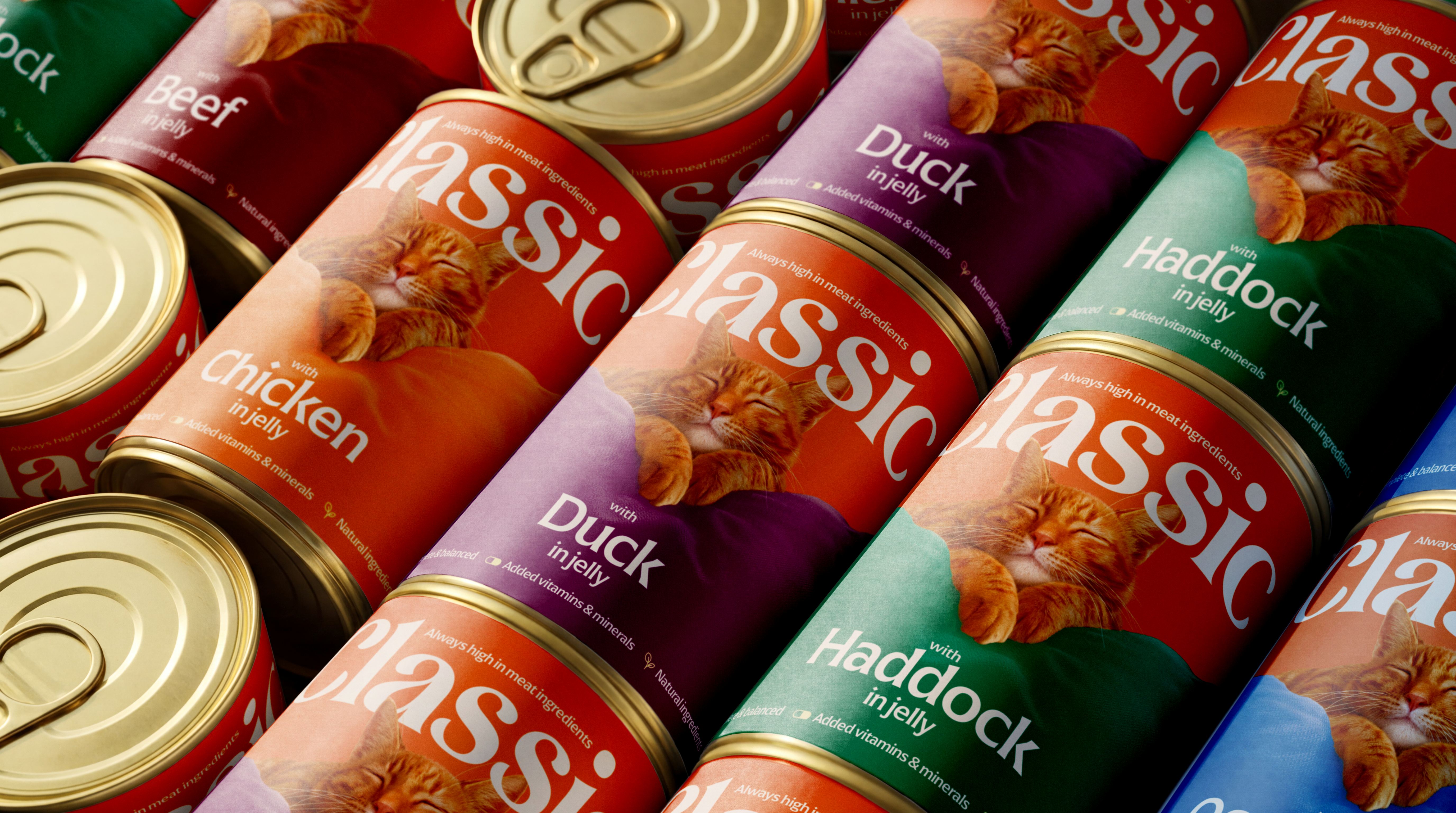
How we repositioned IPN’s Classic Cat brand for supermarket shelf standout
How do you take a budget pet food range with little brand
awareness (but some core shoppers) and turn it into the value shopper’s
go-to choice?
At Chilli, the UK FMCG branding and packaging design specialists, we recently took on the challenge of transforming Classic Cat, a traditional, tinned wet cat food range owned by Inspired Pet Nutrition (IPN).
Here is how we refreshed an outdated brand, redefined its market positioning and created an engaging identity that proves budget never has to mean second best.
Classic Cat was facing a typical dilemma. The budget cat food brand had had little attention and barely any investment over the years, resulting in less presence & a risk of disappearing altogether. Having recently been purchased by IPN as part of the Butchers acquisition, the brand team weren’t ready to give up - keen to prove it could still occupy space in a crowded market, they asked us for help!
We conducted a deep dive analysis into the category, and uncovered a clear problem. Classic Cat had a dated visual identity that showed not only in the image of the cat itself and in the heavy orange tones used, but also in the outdated union jack flag that looked tired rather than premium British.
The combination of a dated look, paired with a low price mark, led consumers to assume the product inside was low quality. The brand was struggling for listings and, where listings were secured, it was hard to find, positioned on the bottom shelf, fighting against private label products Classic Cat was at real risk of being lost on the shelf altogether.
What was the hidden opportunity behind the outdated packaging?
When our strategy team looked past the outdated packaging, they found an incredible secret weapon in the product itself.
In competitor benchmarking, Classic Cat consistently outperformed major market leaders for its high meat content, for its nutritional purity (100% complete nutrition, grain and gluten-free, with no added sugar, salt, or derivatives) and for being 100% British.
What strategy did we use to redesign Classic Cat?
After having unveiled these key points, our brief became clear. We needed to turn Classic Cat from a budget option shoppers ignored or felt embarrassed about, into an accessible, proud choice. As a design team this was an exciting challenge!
To achieve supermarket standout we first brushed up the core meaning of the word Classic: - meaning: ‘Something of great quality that has shown itself to be consistently that way over time. A timeless staple that never goes out of fashion.’
The packaging needed to do that definition justice, to highlight the quality of the product in a simple but authentic way.
This was not about elevating it to a more premium offer; despite it being old and tired there was a core contingent of shoppers who purchased Classic week in week out.
We didn't want to throw the identity out completely. In a market full of blue & purple, orange had some equity - so this brief was about showing the worth and really embracing the value proposition.
We developed a strategy focused on four core pillars:
- Proudly low cost: we framed the price point as the ‘smart choice’ for savvy pet parents.
- Authentically British: we championed the 100% UK sourced ingredients and British farming heritage.
- Uncompromising quality: we put the high meat content, grain free, and natural benefit claims front and center.
- Emotional connection: we ditch the cold, unrealistic pet photography in favour of genuine warmth.
And how did we approach the creative challenge?
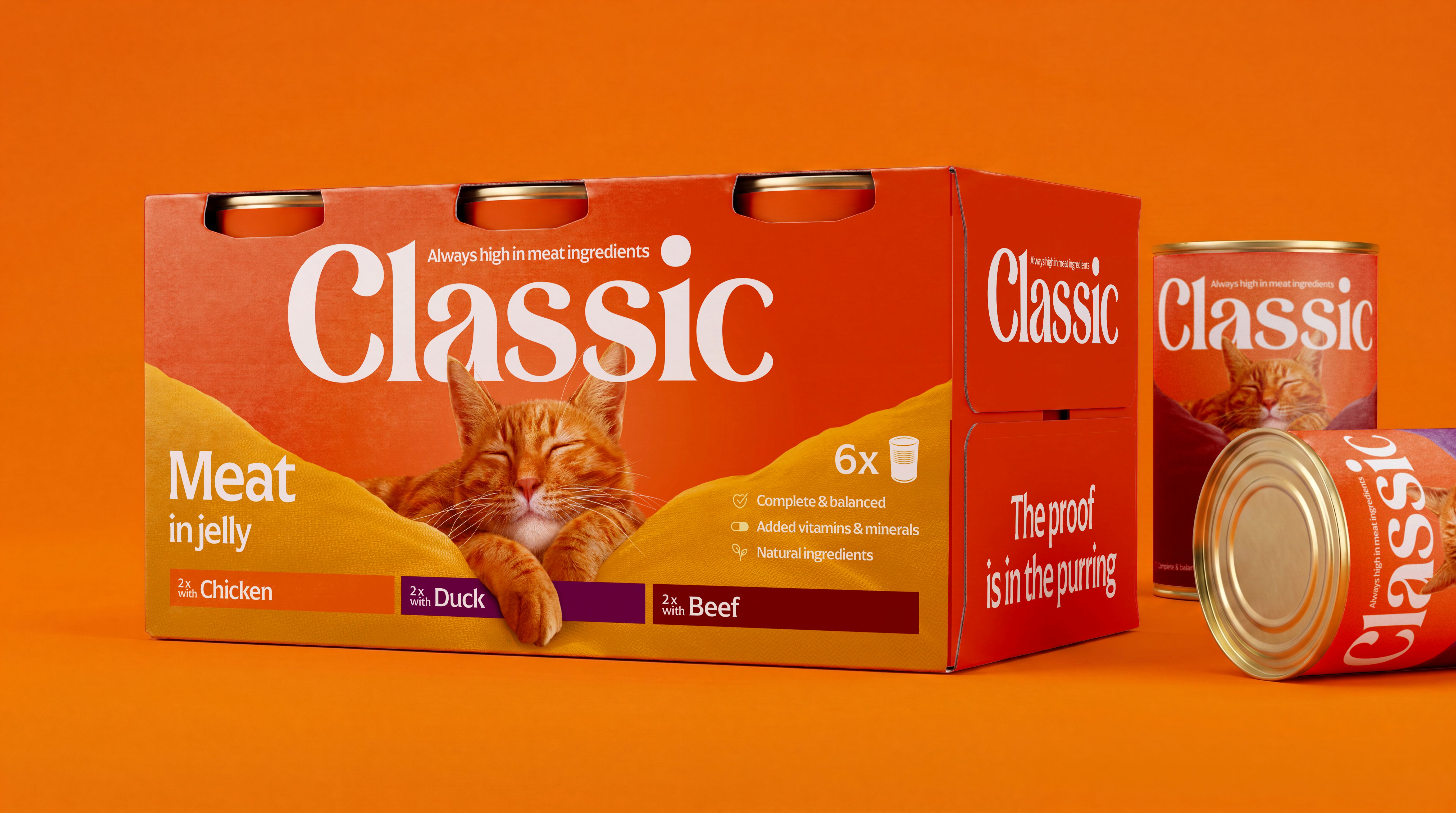
We focused on refining the key brand codes that existing buyers recognise, while modernising the overall layout to evolve the visual identity and packaging design, while maintaining a connection to the original brand.
We tested multiple typefaces to replace the dated script. The new logo type is timeless, legible and confident, striking a balance between approachable everyday value and established heritage.
The biggest change to the pack was undoubtedly the ginger cat. We wanted to keep him, but his current guise was very dated & his mouth had been altered to ‘smile’ meaning he also looked a little unnatural.
Having said that, we did notice a key point of difference versus the competitors - the cat’s eyes were closed and the ‘smile’ was indicative of contentment. For many cat owners, a well fed cat = a happy cat & this contentment was a strong USP. So, after many discussions around AI, photography & stock imagery we decided to commission a digital illustrator to re-draw the cat.
The illustrator captured the unique personality of the original cat; the purring positive contentment of a well fed, slightly smug animal resting on a cozy sofa cushion. We felt that this represented the brand vibe, communicated warmth and engaged emotionally with the pet owners. In a sea of cartoon and simplified AI Cat imagery it was important to the client that this cat felt real.
The next challenge was to articulate the claims. Shoppers decide their options in seconds while in store, so messaging hierarchy is crucial to communicate immediately key features. We streamlined the messagings and we focused on:
- The Promise: Less fuss, more purrs. As every cat owner knows, cats can be fussy about their food. Linking back to contentment & the simplicity of the ingredients this claim highlights both these attributes.
- The Core Benefit: Always high in meat content.
- The Proof Point: Using only UK ingredients, grain & gluten free, and all natural goodness.
Now, the clean visual hierarchy gives pet parents total confidence at the shelf, proving that affordable packaging design can still build a brand to be proud of.
Looking to refresh your brand estate or drive standout on retail shelves?
Get in touch to talk about your next project. HERE you can find out how to get in touch with us.