Fly your flag with Pride: A whistlestop journey through the rainbow!
Written by Claire Barker, Chilli's Senior Account Manager for FMCG brands, with 25 years of marketing experience.
Have you ever looked at a Pride flag and wondered about the story behind those vibrant stripes?
Here at Chilli HQ we’ve been digging a little deeper...
The relationship between the LGBTQ+ community and the world of graphic design is actually a really beautiful, complex and deeply connected tale.
It's a story of everyday people using their creativity to change the world, of queer designers leading the way, and a look at why staying true to those roots matters more than ever in today's world of corporate branding.
When design becomes a way to stand up and be counted…
Long before we saw Pride campaigns in every shop window, design was a lifeline for the queer community. It was about survival, visibility, and making voices heard. Because LGBTQ+ communities were often marginalised (and even criminalised), clever visual symbols were needed to spot a safe place to be yourself, find your people, and eventually, join together to demand the rights everyone deserves.
The Pride flag was never meant to be just another static logo; it was born as a living, breathing symbol for a community that's always evolving. We've all grown to better understand the different experiences within the community - and where we might have missed things in the past - the flag has changed right along with the community, to make sure everyone feels included.
Here is how the design has changed over the last four decades to become the Progress Pride flag we see today.
The rainbow flag evolution…
1978: Where it all began - the original 8-stripe flag
It all started when the legendary Harvey Milk asked Gilbert Baker to create a new symbol for the community in San Francisco. Gilbert wanted something that radiated hope and positivity to move away from the pink triangle, which had a very painful history linked to Nazi persecution. The very first flags were a real labour of love - hand-dyed and stitched together with eight different colours, with each one carrying its own special meaning.
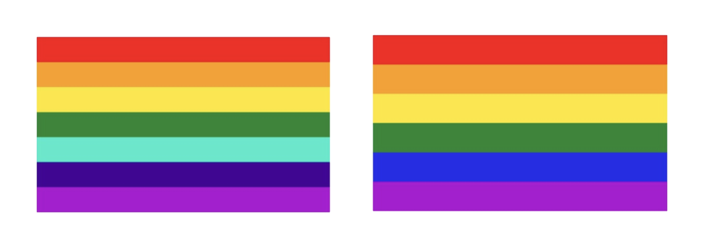
1978–1979: Getting practical with the 7 to 6-stripe standard
The original design had to change quite quickly, mostly because of how things were made back then. First, the hot pink stripe had to go because the fabric was just too hard to find! Then, when organisers wanted to hang flags from lamp posts for the 1979 Pride parade, they realised they needed an even number of stripes so the pole wouldn't hide the middle one. So, they said goodbye to the turquoise, leaving us with the iconic six-stripe rainbow (Red, Orange, Yellow, Green, Blue, and Violet) that the whole world loved for nearly 40 years.
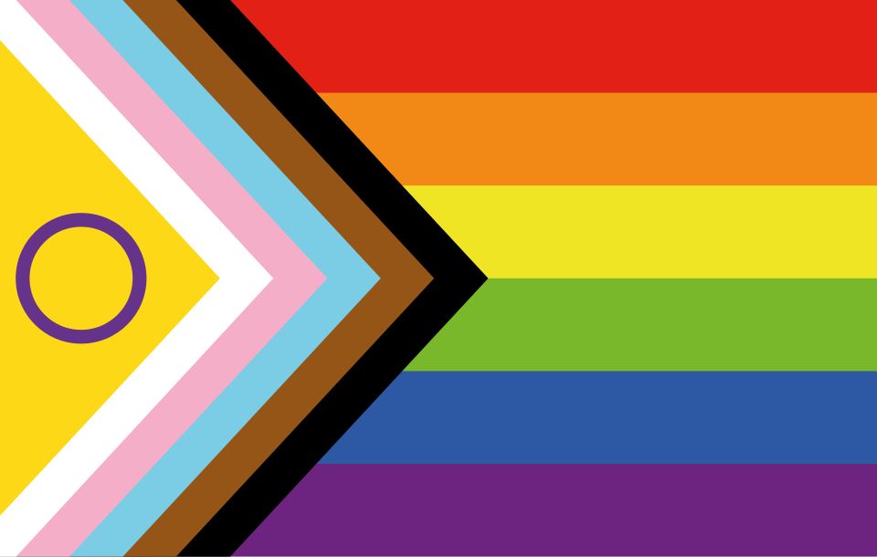
2018: A big step forward with the Progress Pride flag
A few years ago, designer Daniel Quasar decided to update the flag to make sure the message of inclusion was front and centre. The Progress Pride flag kept the beloved six-stripe rainbow but added a chevron pointing to the right—it’s like an arrow showing we’re moving forward, but also reminding us that there’s still work to be done. That new section included:
- Black and Brown: To celebrate and represent people of colour, and to honour those living with or lost to HIV/AIDS.
- Light Blue, Pink, and White: These are the colours of the Transgender Pride flag (designed by Monica Helms in 1999), making sure the trans and non-binary communities are visible and supported.
Ultimately, the Pride flag is so much more than just a pretty pattern.
It's a shining example of how design can be a form of kindness and activism combined.
It shows us how visual symbols can grow and adapt to tell a bigger, warmer story - proving that even a simple set of stripes can function as a dynamic, living document of a community's resilience, evolution and future aspirations.
So, celebrate and fly your flag with Pride this month!