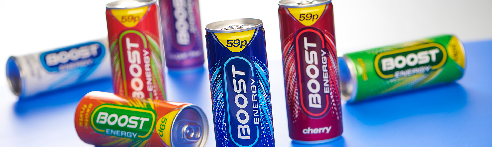
Boost had begun to feel a little dated in their category, so came to us for help.
Boost make high performance, great tasting energy drinks and retail them at incredible prices. Although stockists love them, as an ambitious company with big plans for growth, they began to feel that their brand identity and packaging could do with some reviving.
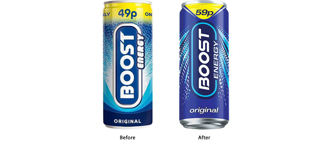
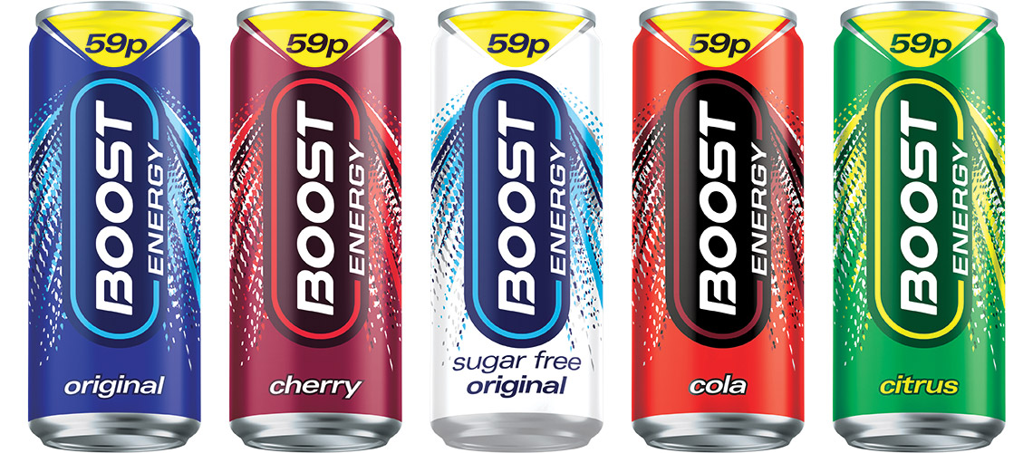
The task to us was to make them look and feel more modern, but we knew we faced a challenge. The range was made up of many different products including energy, sport, protein and coffee drinks. They each needed their own distinct look so that they appealed to their varying audiences. But they also needed to feel like one family. We decided that simplification was the approach we needed to take.
We started by simplifying the logo and incorporated a dynamic “burst” to lift the identity and offer a sense of energy. Then, for each flavour we used one bright colour to differentiate them from one another, and simplified their names. ‘Cherry Burst’ became simply ‘Cherry’.
Adrian Hipkiss, Marketing Director at Boost Drinks said: “ The work tested well with consumers and our numbers are demonstrating resilience in the face of a global pandemic. I would personally recommend CHILLI to help you with your business challenge ”.
Since Boost’s low price point is what makes them unique in the sector, we were careful to find a balance between making the product desirable but not making it appear premium. It was a challenge we feel we executed well, and the results are looking positive.